Success story: Outcome Health leverages Vizlib to deliver data-driven decisions

Outcome Health is a not-for-profit organisation providing innovative GP, clinical and population-health data analytics solutions across Australia. They also offer mental health programmes to support at-risk individuals and are true data-for-good heroes.
These trailblazers bring vital information to where it’s needed most, since data analytics and visualisation still require much development in Australia, Outcome Health is one of the leaders turning the situation around – with the power of visual analytics!
We caught up with Jason Ferriggi, the Chief Information Officer at Outcome Health, together with Director, Jamie Supple, and Senior BI Developer, Mick Browning, to hear more about how they use analytics to improve patient outcomes!
Extracting insights from healthcare Big Data
The amount of data in the healthcare sector is phenomenal. And distilling it into bite-sized chunks for practitioners, clinicians, nurses and support staff is vital. This is where Outcome Health and data analytics come to the rescue.
Traditional patient medical records can be pages and pages long and could take a general practitioner (GP) hours to sift through the information, even when digitised. “We’ve used visualisations to bridge that gap,” Jason reveals. “So what would take a person maybe an hour to scroll through, they can now see within a minute using a visualisation, because it jumps out!”
With the right visualisations, the GP can immediately see what medical assistance a patient requires and book them in. So, it becomes “…a time-saving mechanism to deliver better patient outcomes,” Jason explains.
Outcome Health employed their visionary thinking to create a much-needed app – one that enabled GPs to get the insights for a patient at a glance. They believed the right analytics solution should provide all the context for a patient in 10 seconds! And they got it right, with a bit of help!
Vizlib’s game-changing data exploration and navigation capabilities
Usability is key when it comes to reports. “There’s no point building a report if it doesn’t get used or if it’s hard to use. People will walk away from it. Reports must be easy to use, as end-users are not always the most technically savvy and often face major time constraints—as many GPs do in busy clinics,” Jason added.
Qlik was a considerable help in simplifying complex health data and making it more usable for their customers. Yet, the Outcome Health team felt Qlik Sense’s native capabilities didn’t offer them what they needed. And this is where Vizlib entered the picture!
Added customisation uncovers insights with Vizlib Library
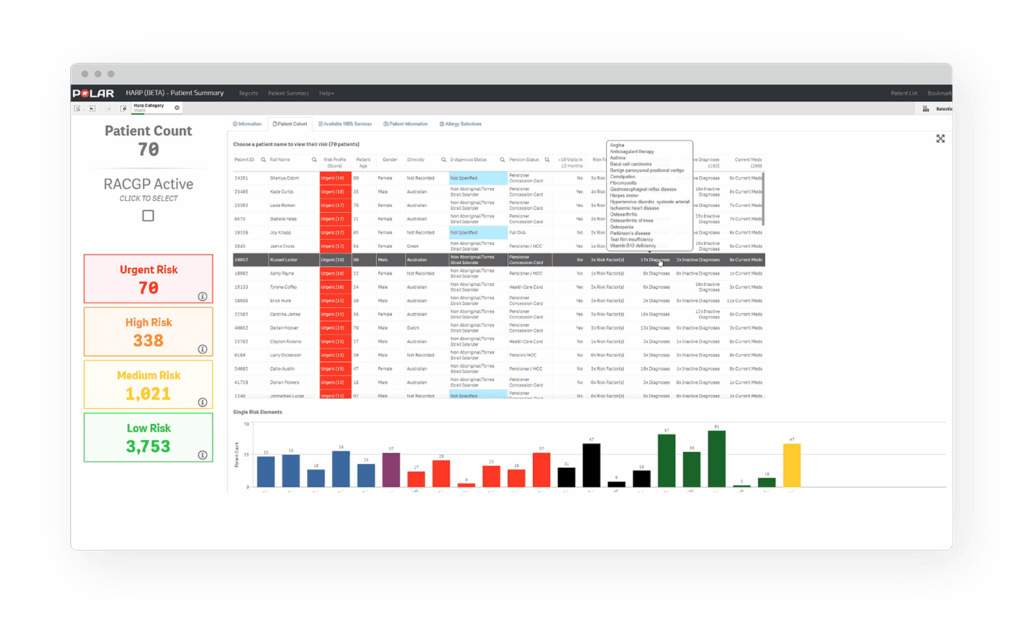
According to Jamie, they’d been looking for ways to customise tables in Qlik Sense. And soon realised the solution lay in Viztips, the highly-customisable tooltip included in Vizlib Library. “…this is the future of displaying lots of complicated data at a patient-level!” Jamie shared.
Jason added that “Viztips changed our life! It sounds simple, but you’ve got so much information to display and being able to hover over it, see the detail, and it then disappears without taking up screen real estate, was a huge benefit.”
Viztips enable their end-users to drill down into patient information, such as risk profile scores. Users can hover over the profile and uncover the Why behind a patient’s score. Or review a list of patient diagnoses on hover, which would otherwise hog most of the dashboard!
“The ability to add so much context on hover has been a huge game-changer for this report. We also use Viztips in other reports.” Jason shared. “The report that displays risk profiles has been totally and utterly revolutionised by Vizlib.”
Another benefit for Outcome Health’s customers is the customisation in Vizlib Library. With customised colours in reports, GPs can spot when a patient last had a health assessment and determine their health care needs and eligibility quickly. It speeds up patient care so “the practice wins, the patient wins, and everyone is happy,” Jason confirms.
Adding extra context on hover with Viztips and greater customisability in Qlik Sense makes healthcare insights pop
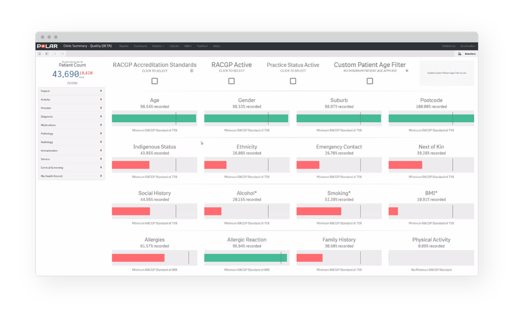
Vizlib KPI Designer displays GP accreditation standards at a glance saving GPs valuable time
Visual decision-making support with Vizlib Gantt
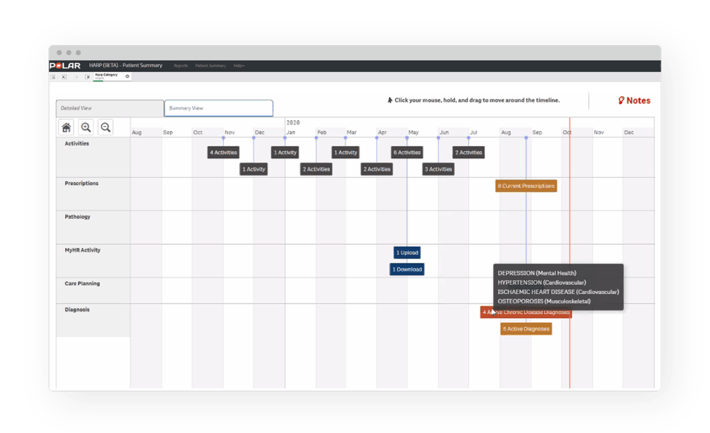
Typical clinical information systems don’t allow you to easily get the bigger picture on a patient. But, Vizlib Gantt provides the summary view and ability to drill-down that GPs need. It saves time they would otherwise spend flipping between numerous tabs.
Outcome Health created the patient-on-a-page app with the help of Vizlib Gantt, as other BI solutions didn’t provide the workability they needed. And their innovative app is now a vital decision support tool for their GPs.
“When we did usability testing with some practices, the first thing they wanted to do was bring up their really complex patients and they were just blown away at how quickly they could see the last year of detail for a particular patient,” Jason concluded.
“To see some of that customisability back in Qlik Sense via Vizlib is refreshing! It means that you have more control and can brand your products better. People sometimes get tired of the default Qlik styles. But the fact that you can customise your product the way you want with Vizlib is very powerful,”