Logi Tutorial: How to Create Dynamic Tables

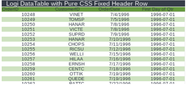
Fixed Table Header
This is a Pure CSS solution (no JavaScript or jQuery) that works in any mainstream browser, including Edge, Firefox, and Chrome. It works with Logi DataTables and CrosstabTables and is compatible with Logi Themes.
Note: The only downside to using Fixed Table Header is that you must pre-define the column widths within the CSS, not the DataTable element.
Include the TableFixedHeader.css file in the head portion of your report using a Logi Style Element:
<StyleSheet StyleSheet=”TableTools.TableFixedHeader.css” />
Set the Class property value in the DataTable element to FixedHeader
The default values for Table Height and Column widths defined in the TableFixedHeader.css file are as follows:
- Sets the height of the DataTable
.FixedHeader tbody { display: block !important; height: 200px !important; background: #F0F0F0; overflow: auto !important; }
- Sets the width for columns 2 through the last column */
.FixedHeader th, .FixedHeader td { width: 100px !important; vertical-align: top !important; }
- Provides 18px padding to the last column header to account for the scrollbar
.FixedHeader th:last-child { padding-right: 18px !important; }
Use :nth-child(#) to set a width for a specific column. The following sets column three to 200px:
.FixedHeader th:nth-child(3),td:nth-child(3) { width: 200px !important; vertical-align: top !important; }
And volia! You have an effortlessly scrolling data table that holds all the information together without jumping pages. This is especially useful for viewing on any mobile device.
Fixed Table Column
Fixed Table Column is another Pure CSS solution (No JavaScript or jQuery). Like the Fixed Header, it works in all newer, major browsers. It works with Logi DataTables and CrosstabTables and is compatible with Logi Themes.
Note: This is not a plug-and-play solution. What we are providing here in a proof of concept, as you will likely need to customize the CSS for the tables you use it on.
Include the TableFixedColumn.css file in the head portion of your report using a Logi Style Element:
<StyleSheet StyleSheet=”TableTools.TableFixedColumn.css” />
Then set the Class property value in the DataTable element to FixedColumn
In the same vein as the Fixed Table Header, we have the Fixed Table column—same concept, but dealing with column rows. Instead of scrolling up and down, it will move laterally.
 The Fixed Table Column is useful in scenarios where you want to show a lot of data without using thousands of columns. For instance, you could use it to showcase specific customer financial data spanning many years without having to page through.
Like the Fixed Table Header, this solution provides a modern UI—especially on mobile devices where you’re limited by screen size and don’t want to jump from page to page. This easy scrolling design element displays all your information coherently while keeping the header or column fixed in place.
It works with all of Logi’s themes, and you’re still able to page, sort, and filter any of the table elements when needed.
Responsive DataTable Reflow
Responsive DataTable Reflow utilizes jQuery Mobile’s Table Reflow mode and a bit of a Logi hack to implement the solution. Unfortunately, this solution does not support Ajax Paging and Sorting in its current form.
This solution requires you to set a data-role and data-mode property on the DataTable. While Logi data tables do not natively support this property, we get can get around this by however, this by using an Include Script element with the following jQuery code:
$(‘#dt1, #dt2, #dt3’).attr(‘data-mode’,’reflow’).attr(‘data-role’,’table’);
In this code, #dt1, #dt2, and #dt3 are the ID values for the DataTables to utilize the reflow functionality.
With mobile devices, you want your reports to be responsive. In our example, we used jQuery mobile, which restyles the table columns as rows. Users can drag and resize as necessary, and the table will be responsive and maintain the information in form.
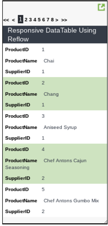
 This is important because you don’t want to have to design two data tables for multiple devices. You could have one report for mobile and one report for desktop, but that approach doesn’t really identify what happens when a desktop user resizes their browser. Our solution does!
Adaptive DataTable Column Toggle
Our final responsive design solution is the column toggle, another jQuery mobile solution that is similar to our responsive columns/rows element. However, this one behaves a little differently. As the size of the browser is increased, we are including fewer priority columns. This is identified within the class property of the column.
This implementation requires a similar Logi hack to the Reflow solution. Again, this solution does not support Ajax Paging and Sorting in its current form and requires you to set a data-role and data-mode property on the DataTable as well as a data-priority property on each column.
Once again, since Logi data tables do not yet natively support these properties, we get around this by using an Include Script element with the following jQuery code:
$(‘#dt1, #dt2, #dt3’).attr(‘data-mode’,’columntoggle’).attr(‘data-role’,’table’);
This solution allows us to shrink the browser and stay on a mobile device. When it’s unexpanded, the user will only see the priority columns. When resized larger, the user will see the other columns. And again, everything is still available for the table elements—sorting, paging, and filtering.

