4 Financial Dashboard Examples for 2023
Financial dashboards bring performance into focus by collecting the most important metrics and indicators in one location. But when organizations build their financial dashboards from the ground up, challenges often arise. A primary hurdle is making the right design choices to create dashboards that drive successful business decisions.
To overcome this hurdle, it helps to incorporate ideas that have already been implemented, evaluated, and improved on by others. With that in mind, we have created a collection of financial dashboard examples that real users rely on for effective decision making. Your dashboards don’t have to look exactly like these, but you can draw on them for inspiration.
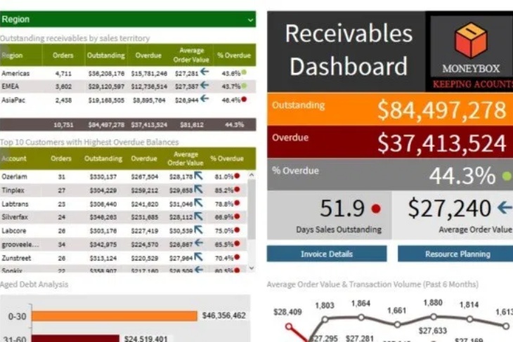
Accounts Receivable
The goal of any accounts receivable dashboard is to highlight delinquent accounts that require immediate attention while simultaneously revealing broader trends about revenue collection. The dashboard in this example lets users jump between geographic regions, instantly evaluate current performance, and make careful decisions about resource planning. It’s designed to do exactly what all good dashboards should: put all relevant data and decision making tools in one place.
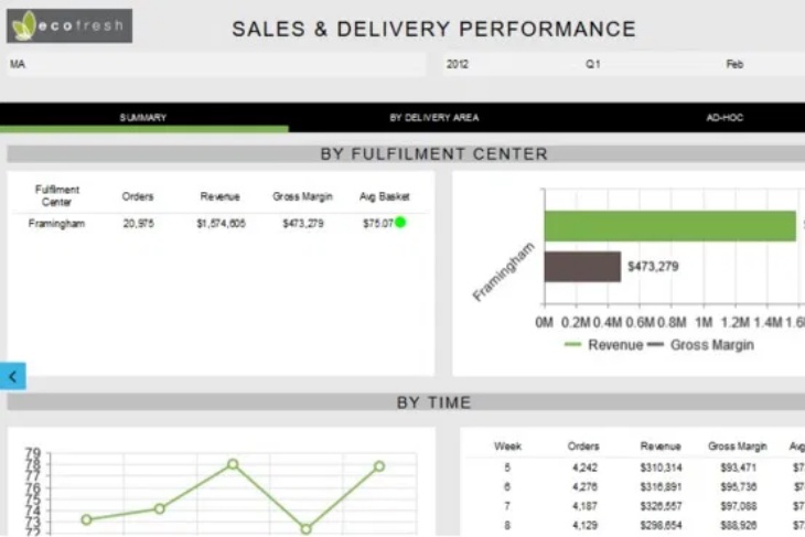
Sales and Delivery Performance
In this example, you can see how a meal box delivery service uses a customized dashboard to track its sales and delivery performance. Tabs along the top allow users to quickly break down sales by delivery area, or according to an ad hoc series of criteria. Dynamic elements throughout the dashboard also make it easy to drill down into the data to explore sales and delivery performance in detail. By turning these metrics into a dedicated dashboard, this company ensures crucial financial insights are not getting lost among the rest of the data.
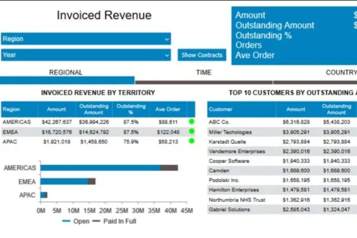
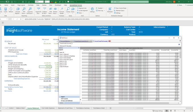
Invoiced Revenue
The ultimate purpose of dashboards is to make data accessible to users across the organization. This is an example of how one company created a dashboard to track only the amount of invoiced revenue broken down by time, location, or customer. The dashboard condenses essential information onto the first page, but users have the option to look behind the metrics at the root data on which they are based. The information here could have been incorporated into one of the other financial dashboard examples. Instead, this company decided invoiced revenue required its own dashboard. Great dashboards provide extensive information, but all with a common purpose or focus.
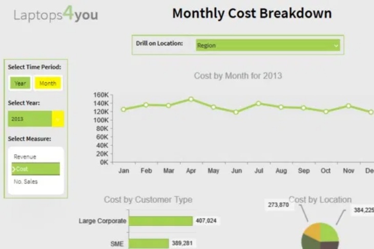
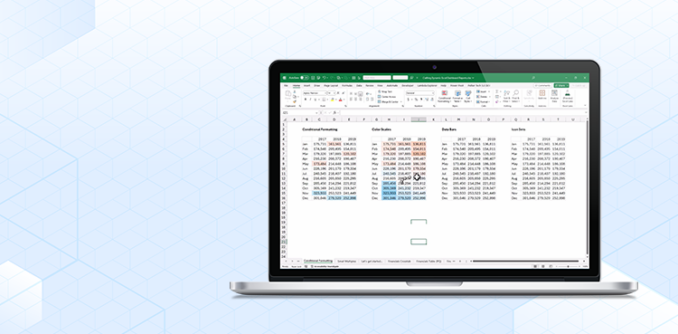
Dynamic Dimension and Measures
In this example, it’s clear how a dashboard with a straightforward design can condense a lot of information into actionable insights. This dashboard was originally created to give users a quick overview of important financial indicators like revenue and costs. Each one of those indicators can be broken down by time or region, and the resulting information is displayed in a helpful line graph to illustrate historical performance. With a few clicks and a minute or two of study, users get a deep understanding of financial strength updated with the most recent data.
When reviewing these financial dashboard examples, one thing is immediately apparent: There’s not one right way to design a dashboard. The best approach is to figure out what users need in terms of data and tools, and then build a custom dashboard with best practices in mind. As long as it increases efficiency, productivity, and understanding, it’s working regardless of how it looks.
After your dashboards are up and running, it’s up to users themselves to make the most of them. Learn how to optimize your financial dashboards by downloading our whitepaper: How to Drive Your Dashboards Like a Boss.
Related Resources

2023 Finance Team Trends Report


Financial Reporting Buyer's Guide