Vizlib Heatmap: How to use Heatmaps in your Qlik Sense dashboards
Vizlib Heatmap for Qlik Sense: What is a Heatmap?
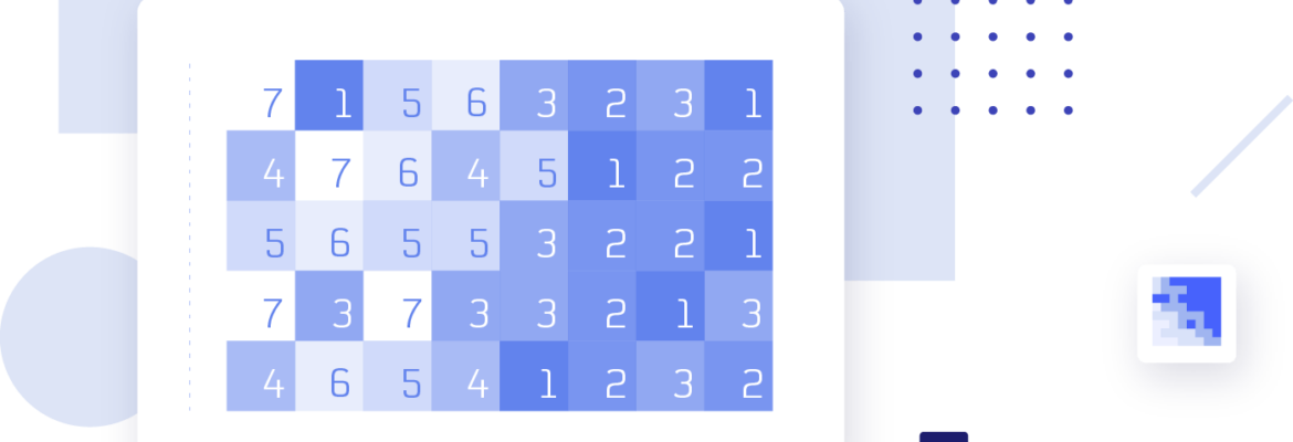
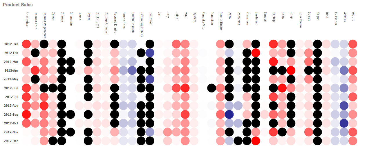
A Heatmap is a data visualisation tool that displays values in a colour-coded format. Heatmaps are a great way to analyse large or complex data sets as colours are easier to distinguish than a multitude of numbers. And, they’re simpler to interpret. Heatmaps present a self-explanatory visualisation—the darker the colour shade, for instance, the higher the value it represents.
Anyone working with data can enlist the help of a Heatmap and get a general view of numerical data. Heatmaps help users identify and highlight areas of interest in their data quickly. They provide the tools for a user to dig deeper into their data and carve out valuable insights. Heatmaps enable users to analyse multi-variate data to reveal patterns, trends or correlations in the data set. Or to show variance.
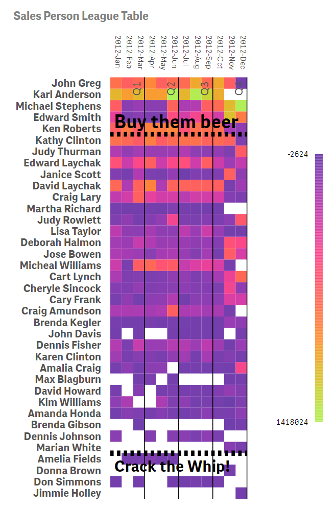
For a business leader, this visualisation tool can help analyse your business’ performance against competitors, visualise sales by region, or examine employee attendance. You can set specific colours for specific data levels. For example, to plot your competitive position, you could use colours like red, yellow and blue to represent categories like laggard, moderate and leading position.
Heatmaps show you where the heat is in your business data. You can leverage the insights they provide to make your competitors sweat!
How do analysts use Heatmaps across industries?
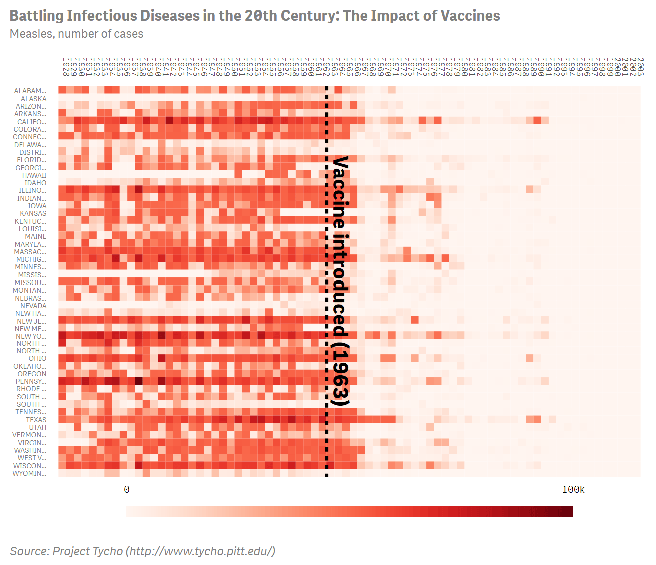
In Healthcare, Heatmaps are useful for showing metrics by weekday or hour, as these organisations are always pushing to optimise patient flow or improve staffing.
Practitioners in the Finance sector use Heatmaps to visualise the quality of financial information or for analysing trading in an easy-to-grasp visualisation.
Retail analysts gather and analyse shopper flow data with Heatmaps to determine whether specific dates and times receive more traffic.
In Manufacturing, global execs analyse economic trends with Heatmaps for their Purchasing Managers’ Index (PMI). Manufacturers also monitor the performance of their production bays in real-time with Heatmaps to identify critical issues as they arise.
High Tech companies use Heatmaps in the website market to show where users click on a web page or where the clicks originate from. Or in cybersecurity, Heatmaps can display supply and demand data.
In the Energy and Utilities field, analysts use them to display average energy use per day.
Heatmaps in the Communication Sector, like attention maps, visualise which channels are most viewed by users.
Public Sector analysts use Heatmaps to review data like a job happiness index by role.
In Life Sciences, molecular biology Heatmaps represent the level of expression of many genes across several comparable samples. Heatmaps can also represent population density, per-capita income or average temperatures to aid and simplify research.
Consumer Product companies chart user retention and surface insights to analyse the risk of customer churn in particular cohorts.
What is the Vizlib Heatmap for Qlik Sense?
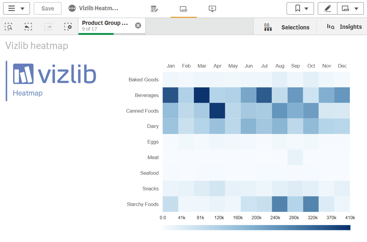
Vizlib Heatmap extension for Qlik Sense is a simple, graphical representation of your data. It displays individual values as colours so you can get the business insights you need at a glance and drive value.
Your business intelligence will be smarter with Vizlib Heatmap features like:
- Highly customisable: Customise and format Vizlib Heatmap’s elements to suit your dataviz needs and show your audience a clear message.
- User-friendly: This is dataviz for everyone. It is easy-to-use and can help raise data literacy levels at your organisation.
- Enriching context: Add tooltips to your Vizlib Heatmap to provide additional context to your data story. Or use Reference lines to guide the audience’s understanding of your visualisation.
Vizlib Heatmap also includes our handy HTML Tooltip capability, enabling you to provide additional, customised text and image context on hover. You can speed up the time to insights for technical and non-technical users with the HTML Tooltip.
Heatmaps bring life to your data and help you hone in on relevant data trends, like night-vision goggles! They can help you focus on insights that generate greater business value.
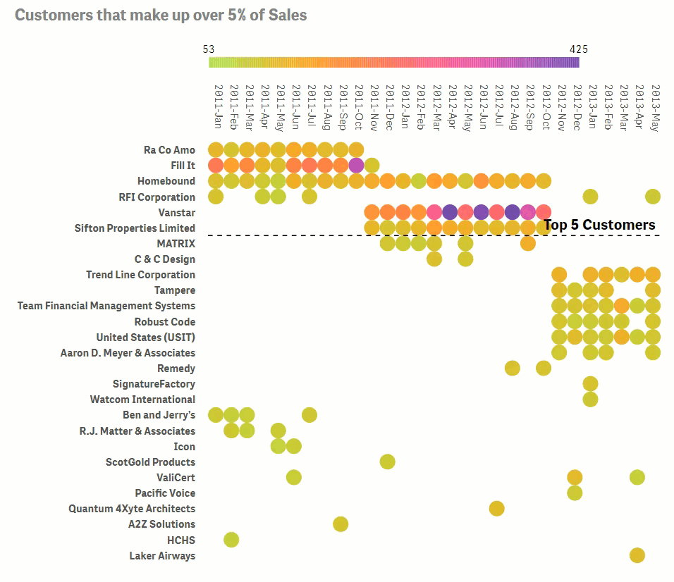
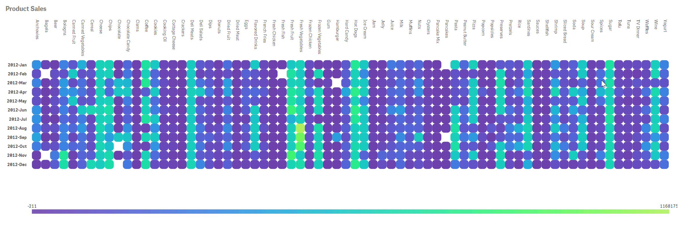
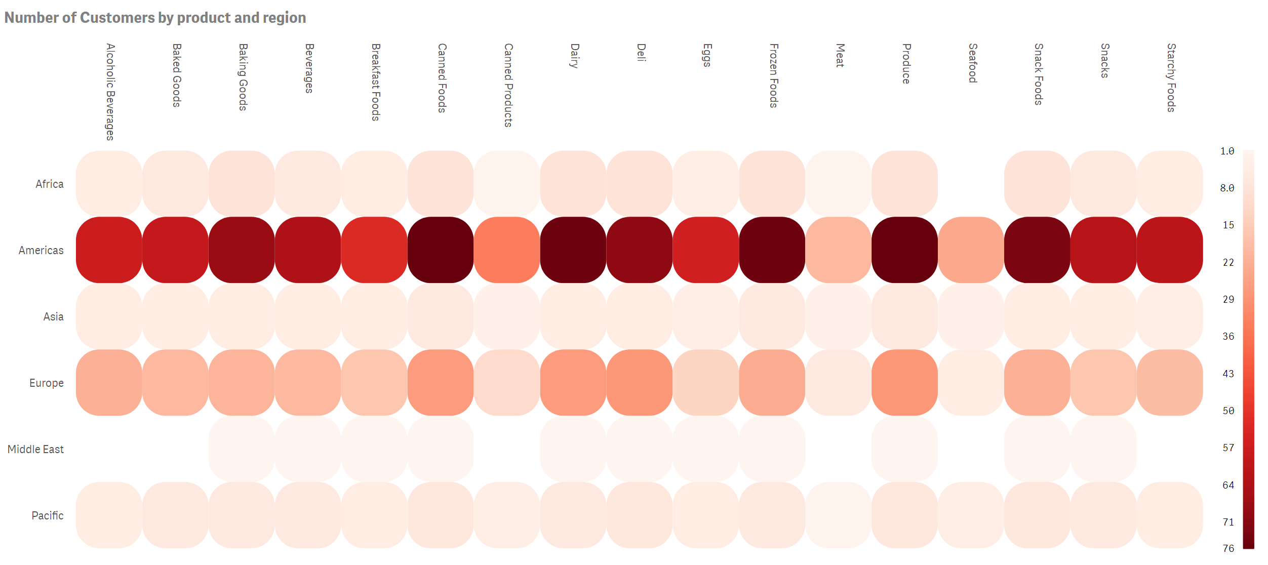
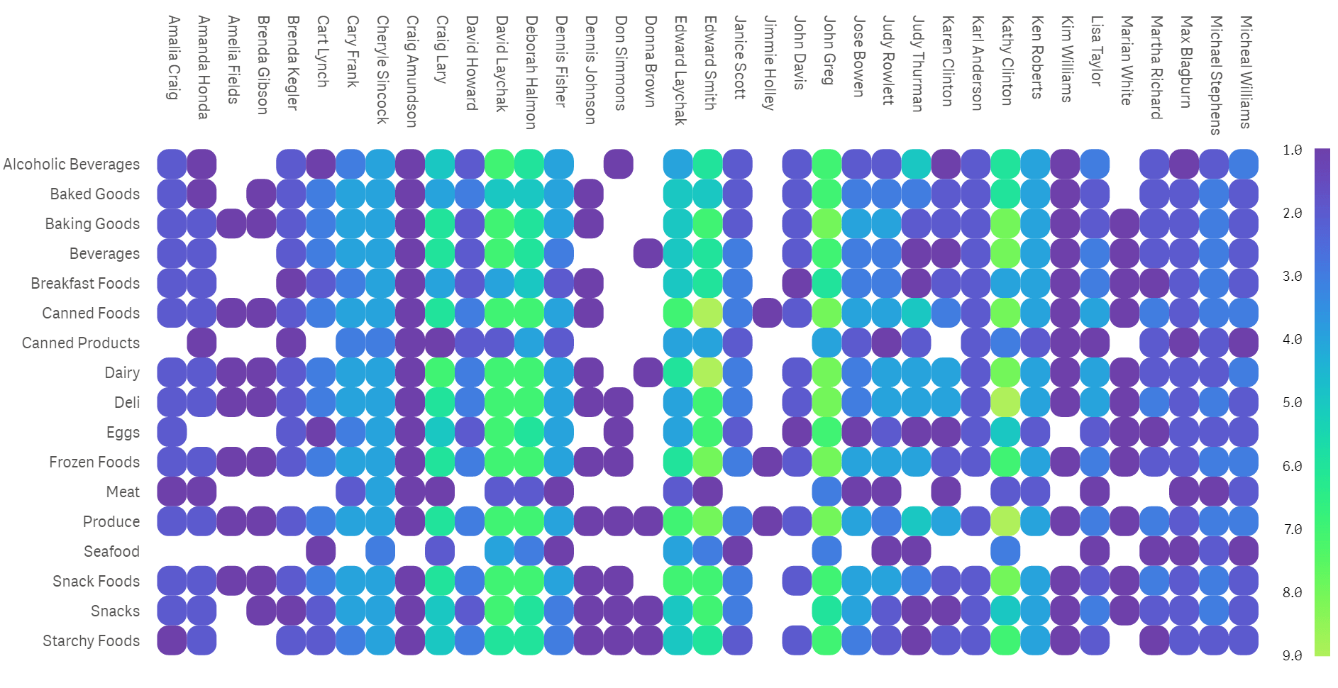
Learn more about the powerful Vizlib Heatmap here. And here are some examples of Vizlib Heatmap visualisations.
2020 © Vizlib Ltd. – All rights reserved.