Ultimate Dashboard Design Guide: Top Trends, Examples, & Best Practices

A well-designed dashboard can be the difference between decision-making at a glance — and getting lost in a sea of data. But with so many variables—users, data sources, visualizations, devices—it’s easy to end up with dashboard designs that look good but don’t deliver meaningful insights.
This guide is your end-to-end playbook for creating dashboards that are not only beautiful, but also smart, scalable, and user-friendly. Whether you’re designing for executives, analysts, or everyday users, you’ll learn how to make dashboards that inform, engage, and drive action.
What are Dashboards? An Introduction
Dashboards, by the most simple definition, are a preview of whatever information is deemed most critical for the user who’s looking at it. Think about your car dashboard… You’d never fix your car using it alone, but you’d certainly look at it first to understand the health of your vehicle and to understand its status at that particular time.
From marketing, to operations, to sales, and everything in between, dashboards present users with a simple, succinct view, allowing them to explore, analyze, monitor and act on their data. The definition of what a dashboard actually is has varied over time, but one of the more agreed-upon statements comes from Stephen Few:
“A dashboard is a visual display of the most important information needed to achieve one or more objectives that has been consolidated on a single computer screen so it can be monitored at a glance.”
At the end of the day, the user should be able to see, at-a-glance, useful data visualizations and analytics that show trends, updates, KPIs, metrics, and other key data points that will allow them to monitor the status of some process or department. Dashboards in business intelligence (BI), after all, are direct derivatives of dashboards in cars, which are used for the same purpose.
4 Types of Dashboards and Their Purpose
Not all dashboard UIs serve the same function. Depending on the user and the business goal, dashboards can vary widely in structure and intent. Below are the four most common types of dashboards, each designed to support a specific purpose and audience:
- Operational Dashboards provide real-time or near real-time data, helping frontline teams monitor day-to-day activities such as sales performance, inventory levels or website traffic.
- Strategic Dashboards are typically built for executives and senior leadership, strategic dashboards focus on high-level KPIs and long-term objectives.
- Analytical Dashboards are used to explore data in depth, often by data analysts or business intelligence teams.
- Tactical Dashboards sit between operational and strategic dashboards. They support mid-level managers by tracking performance against departmental goals, helping translate high-level strategy into team-level execution
Universal Design Principles for Creating Amazing Dashboards
Whether your application’s embedded dashboards and reports are due for a refresh or you’re just getting started designing business dashboards, here are some best practices to follow:
The ‘5-Second’ Rule
It’s immediately evident which problem each of these dashboards is solving, and at-a-glance, each dashboard is able to answer the most frequently posed business questions – in regard to each specific case.
Thoughtful, Logical Layouts
Each dashboard should be logically organized, with significant insights arranged in a manner that makes sense. When designing your dashboard, include the most substantial findings in locations that are likely to be noticed first – i.e., top left to bottom right, in order of diminishing importance. High-level insights are displayed first, then trends – which contextualize the insights – and finally, items of increasing granularity.
Quality Over Quantity
While there are obviously exceptions, you want to limit the number of items on your dashboard. More than five to seven items translates into clutter and noise, and distracts from the intended purpose of the dashboard.
3 Dashboard Design Best Practices to Follow
When designing your dashboards, there are some current “Best Practices” that you should keep in mind. Ultimately, a user should be able to see and understand the data at a glance, and by overloading your dashboard with a clunky layout or bad color schemes, you’ll end up obscuring rather than highlighting the data. Here are some more dashboard design best practices to follow:
Use Asymmetrical Layouts to Guide Focus

Asymmetrical design isn’t just about aesthetics—it’s about function. By placing larger, more prominent elements strategically across the screen, you can naturally lead users’ eyes to the most important data first. This breaks the monotony of uniform grids and helps prioritize what matters most. Asymmetry creates a modern, visually engaging experience that also improves clarity and readability.
Apply Color with Purpose
Color should do more than decorate—it should communicate. Choose a limited palette to avoid overwhelming the user, and use color strategically to emphasize outliers, trends, or areas requiring attention. Reserve bright colors for highlights and keep the rest of the dashboard in neutral tones. Most importantly, consider accessibility by using high-contrast combinations and avoiding color-only indicators, which helps users with visual impairments stay engaged.
Incorporate Icons as Visual Cues
Icons are a powerful way to reduce clutter and improve comprehension. Instead of overloading users with text or dense tables, icons can serve as quick, universally recognized signals. They help reinforce meaning, simplify navigation, and break down complex concepts into visual shorthand. When used alongside key metrics or navigation menus, icons make your dashboard more intuitive and user-friendly — especially for non-technical audiences.
3 Dashboard Design Mistakes to AVOID
Even the most well-intentioned dashboards can fail if certain outdated or ineffective design elements are used. Poor choices in visual styling or layout can cause confusion, slow down decision-making, and even turn users away. To keep your dashboards sharp, relevant, and easy to use, steer clear of the following common pitfalls:
Using Gradients in Data Visualizations

While gradients can be visually appealing in graphic design, they often fall short in dashboards. They make it difficult to interpret data clearly, especially when used in charts, graphs, or KPIs. Gradients can blur distinctions between values and reduce visual clarity. Stick to flat, solid colors that offer strong contrast and help users instantly interpret the data.
Relying on Analog Gauges

Analog gauges may have been popular years ago, but today they’re more of a nostalgic relic than a functional tool. These bulky visuals take up too much space and only show one piece of information at a time. Modern design calls for sleeker, more efficient alternatives—like bullet charts or progress bars—that convey performance against goals in a compact, clear format.
Including 3D Visuals

3D effects can add visual complexity, but rarely add value. In fact, they frequently distort perception, making it harder to compare values or interpret patterns. They also date your dashboard design, making it feel clunky or outdated. Clean, two-dimensional charts and graphs are easier to read, load faster, and align with modern design standards that emphasize functionality over flair.
How to Create a Dashboard in 5 Simple Steps
Developers—not designers or UI/UX experts—are usually the ones tasked with creating dashboards and reports. Fortunately, these days, it doesn’t take an expert designer to create effective UIs. Here’s how you can get started building a dashboard in five simple steps.
Step 1: Know Your User When Designing a Dashboard
Understanding your user and how they will use your dashboard is a good first step. Your team can gain important context from understanding what is important to your users, what data means to them, and how data will shape their decisions. You may be tempted (or sometimes forced) to make assumptions based on datasets, which results in visualization driving the end-user experience. Rather than designing based on what fits in a visual, try asking a few key questions first:
- What information does your user need to display?
- What are your users interested in?
- What are their pain points?
- What are their goals?
- What purpose will each element serve?
- What meaning do I want to convey?
If you ask these questions first, you can produce content that reflects your users’ answers, leading to a better overall dashboard experience. Click play on the video below to learn more:
Step 2: Precisely Define the Problem Your Dashboard Will Solve
Next, ensure you have a clear understanding of the problems your users are facing, and how your dashboard will solve them. At this stage, you’ll also want to define the metrics that matter most to your users and begin to conceptualize which data visualizations work best at representing them.
Here, you’ll want to be in constant communication with your data teams to ensure your suggestions are aligned with what’s technically feasible – you wouldn’t want to recommend a tree map if the problem was to identify outliers, now would you? As a side note, make sure you define what each user is hoping to get from the dashboard.
Step 3: Summarize, Don’t Include All the Details
The more details you have in your dashboard, the more cluttered your dashboard becomes. Every piece of information doesn’t need to appear on your dashboard all at once. Shoving all of the information you have available into a dashboard just isn’t a good solution for you or your users (but some people try it anyway). You’ll be much better off if you think critically about your content (i.e., what is actually important). Careful consideration of what needs to be included or not helps you ensure that your dashboards are effective and easy to use.

Which visuals you choose can make a big difference in user experience, so choose those wisely as well. If you’re summarizing information, you’re best off using a chart. Tables—while potentially popular with your dev team—are best used for displaying details.
Step 4: Keep Your Dashboard Design Simple and Clean
In addition to summarizing information, you’ll want to keep your dashboards simple and easy to use more generally. We’ll say it again—just because you have loads of information you could provide doesn’t mean all of that information belongs in your dashboard. If you need a few inspirational quotes to help support your quest for simplicity, here are some of our favorites:

- The Incredibles’ Syndrome says, “If everything is important, then nothing is.”
- KISS – Keep It Simple, Stupid. Less is more; a clean design is a good design.
- The Paradox of Choice by Kevin Schwartz: The more options you provide, the more complex the decision-making process is.
And if someone on your team says the phrase, “Someone may be interested,” then it’s time to put on the brakes. If you stick with information that’s useful and meaningful, you’ll be supporting your end users and their goals. Everything else runs the risk of being visual noise and confusing your users.
Step 5: Test, Test, Test, LAUNCH
While you’ve been rigorously testing your designs throughout the entire process and gathering feedback, there finally comes a time for you to launch your dashboards and push them into production. Once you’ve done so, be sure to observe your users to gauge what they’re thinking, how they’re behaving, and what they’re feeling. Your dashboard design process should never truly end, and you’ll continue to make alterations and refinements to rule out any problems that may arise or may not have been accounted for.
Bonus Step: Is Your Dashboard Still Cluttered? Drill Down to Details
If you’ve kept things simple, kept your users in mind, and still have a dashboard that looks cluttered, look for a higher-level summary, then drill down to more detailed information. While this practice does move your additional data one more click away, that extra click buys you more real estate and the opportunity to provide greater focus.
Good dashboard design means guiding your users to what is interesting and relevant to their immediate needs—and that can make all the difference.
3 Inspiring Dashboard Design Examples That Work
To bring the principles of great dashboard design to life, the following examples showcase how real-world dashboards can translate data into clear, impactful insights. Each is purpose-built—tailored to its audience and objective—demonstrating how thoughtful design choices can elevate both usability and value.
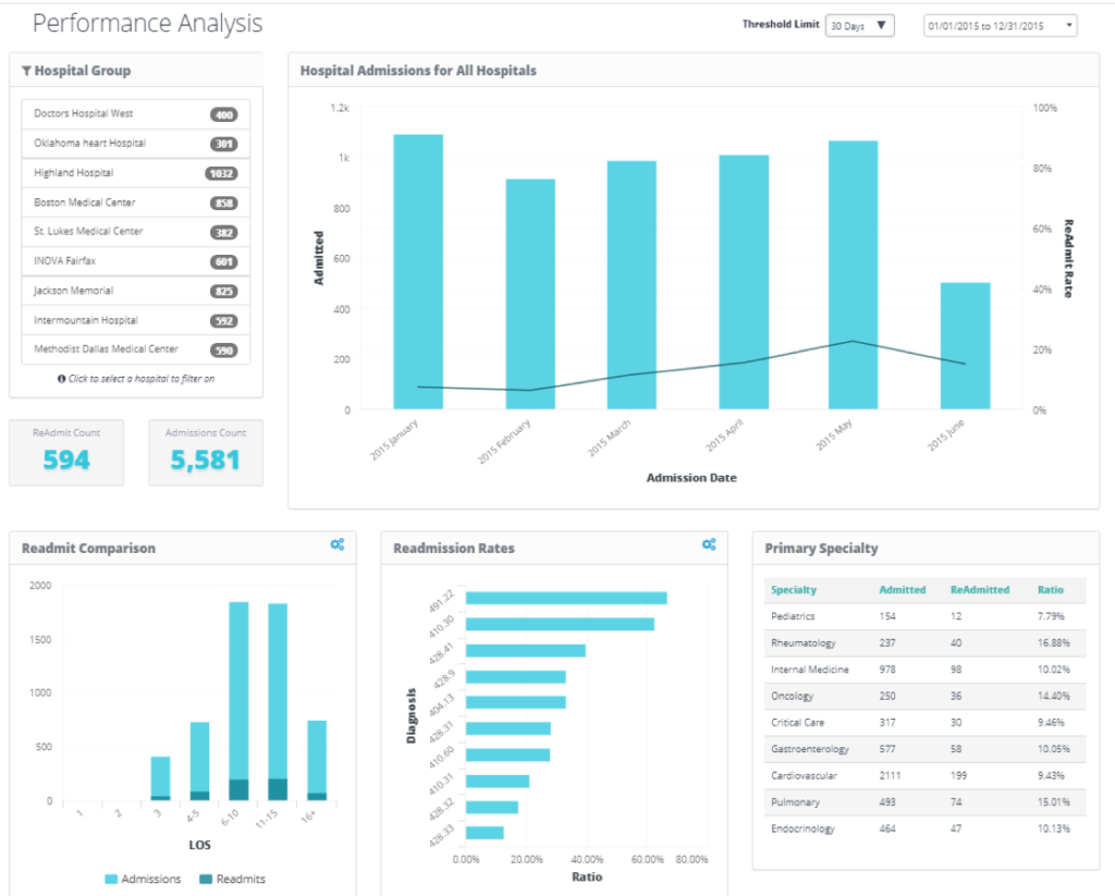
Store Operations Dashboard
The Store Operations Dashboard focuses on real-time performance monitoring across locations. It prioritizes operational metrics that allow managers to respond quickly to issues, with clear visual indicators and drill-down capabilities for further analysis.
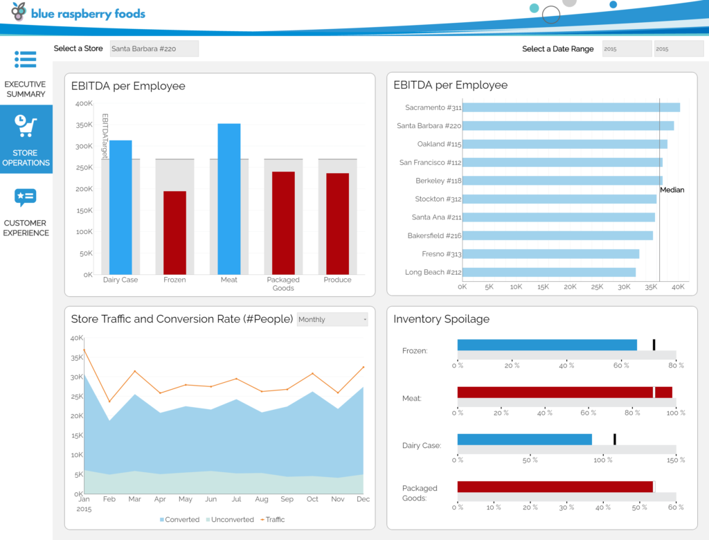
Retail Sales Performance Dashboard

The Retail Sales Performance Dashboard highlights sales trends, targets, and KPIs in a visually engaging format. It enables sales leaders to track performance over time and across product categories, empowering data-driven decisions at both strategic and tactical levels.
Call Center Dashboard
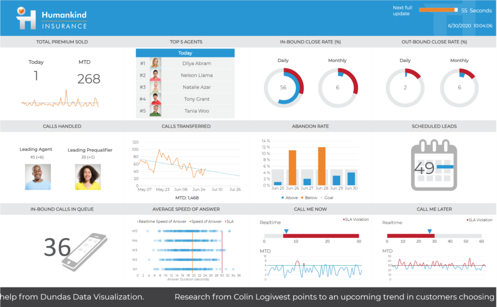
The Call Center Dashboard provides a dynamic view of agent performance and customer engagement metrics. Built to handle frequently changing data, this example includes animations and responsive visuals to help teams stay on top of SLAs and service quality in real time.
10 Dashboard Design Trends to Watch
Dashboard design is always evolving. To make your dashboards as effective and accessible as possible, you need to stay on top of trends that are resonating with users. Here are some of the dashboard design trends we’ve got our eyes on:
1. Asymmetrical Design
Traditional dashboards use neat blocks and rows. Asymmetrical design overlays content to create a more infographic-like experience. Inspired by Brutalism, this bold, unpolished aesthetic draws attention and makes dashboards visually compelling and functionally focused.
2. Data Storytelling
Dashboards are evolving into storytelling tools—focused, KPI-driven, and easy to follow. Rather than dumping data, the goal is to guide users to a clear understanding of what’s happening and what it means for the business.
3. Mobility Is Still Top of Mind
As mobile and tablet usage grows, dashboards must adapt to smaller screens. Mobile dashboards should complement desktop views, not compete. Prioritize relevant content and features that make remote users agile and efficient.
4. Dark Mode is Becoming Standard
With users spending more time in front of screens, dark mode is more than a design preference—it reduces eye strain, conserves battery life, and meets user expectations. Offering a dark theme option can enhance the dashboard experience and make your design feel more modern and customizable.
5. Less Really Is More
Dashboards should surface only the most relevant information. Avoid logos, heavy visuals, and unnecessary text. Use wireframes to focus on typography and minimal charts, and rely on images or icons to convey meaning where possible.
6. Rethink Gauges
Gauges once offered a quick read, like in a car—but they take up space and show limited data. Better options include line charts, bar charts, or bullet charts, which offer more depth and comparison in less space.
7. Accessibility and Inclusive Design Matters
Accessible and inclusive dashboard sign is no longer optional. Dashboards must account for visual impairments, including color blindness, and be compatible with screen readers. High-contrast color schemes, alt text, and keyboard navigation support are essential for making dashboards usable for everyone, regardless of ability.
8. Be Dynamic
Dynamic dashboards allow users to update and customize views. Features like drag-and-drop, import/export, and integration with platforms like Salesforce or Google Analytics increase flexibility and relevance for every user.
9. Interactivity
Interactive dashboards engage users through features like video, overlays, drilldowns, and filters. These tools promote exploration, deeper insights, and more meaningful user interaction, helping data come alive in real time.
10. Location, Location, Location
Maps in dashboards are getting smarter. With built-in GPS data, you can track behavior, access trends by area, or measure metrics like distance traveled—all in real time and with geographic precision.
Dashboard Design FAQs
1. What is the difference between UI/UX?
UX (user experience) encompasses everything about how a particular design functions: from where a particular item is; to how large it is when compared with other elements; to what (if anything) happens if you click or tap on it, and much more.
UI (user interface) is an important component of user experience, in that how something looks affects if and how a user pays attention to it and/or chooses to interact with it.
2. Do you utilize wireframing as a design principle for dashboards?
Wireframing is an essential step in beginning the dashboard planning process. Wireframes are similar to blueprints, and you wouldn’t build a house without a blueprint. Knowing where everything is going beforehand is a huge development time-saver and provides users with a much better experience.
3. What are the most essential fundamentals to consider when designing for mobile?
Design fundamentals apply to anything, including mobile design. Fundamentals that become very important to the mobile design experience include:
- Typography, especially how fonts size down
- Size of text, menu, buttons, etc.
- Imagery, for example using icons on buttons instead of text to save space
4. What are some Google Chrome extensions that you use/recommend for designing?
There are many extensions for Google Chrome to use when designing. We do recommend keeping these extensions off when not in use. Mostly, as a lot of design-related extensions can slow down your browser. With that caveat, there are three that we like to recommend:
- WhatFont: You can tap/click on page text and it will tell you what font they used, what size the font is, and the font HEX code.
- ColorZilla: Similar functionality as WhatFont, but for colors. There is also a link to their CSS3 gradient generator, which comes in handy.
- Awesome Screenshot: We like this tool as it can do full-page screenshots. It’s a good way to record (and also annotate) sites that inspire you.
Design Dashboards That Make an Impact—Not Just Look Good
Good dashboard design is as much a science as it is an art. And now that you understand what dashboards are, what good dashboards are comprised of, and how good dashboards are designed, there should be nothing stopping you from designing thoughtful – and more importantly, impactful – dashboards.
Here are some takeaways to remember as you set out designing dashboards:
- Understanding your users and how they will use your dashboard is important.
- More is not always better when it comes to dashboard design.
- Clean design is good design.
- Use charts for summaries and leave details to tables.
- Reduce design clutter by looking for a higher-level summary, then narrow down to more detailed information.
At insightsoftware, our business intelligence solutions go beyond data visualization. We empower finance, operations, and business leaders to create dashboards that deliver real-time insights, connect to hundreds of data sources, and drive smarter decisions—without relying on IT. Whether you’re building executive dashboards, self-service analytics, or embedded reporting, our platform gives you the tools to turn information into insight.
Ready to build better dashboards that actually move the needle? Head here to explore our BI Solutions.

The Definitive Guide to Dashboard Design
Download Now: