Effective Dashboard Color Scheme for Analytics

This post was written by Midori Nediger, Information Designer at Venngage, an online infographics tool.
Color choice is paramount when it comes to designing effective dashboards and reports for applications. Used properly, color can enhance, clarify, and add insight to a visualization. Misused, color can hamper understanding, often distracting from and obscuring the data.
Aside from any aesthetic considerations, dashboard color schemes should tell users something about the data that the dashboard aims to communicate. Here, I’ll outline how application teams can use dashboard colors to convey three messages:
- Encode quantity
- Indicate groupings (to label data)
- Create contrast (to focus attention on key information)
What are Dashboard Color Schemes?
Dashboard color schemes are the strategic use of colors in data visualization tools to enhance readability, convey information effectively, and guide the viewer’s attention to key insights. In the context of dashboards, which display critical metrics and data points, color schemes play a vital role in making the data understandable at a glance.
Difference Between Dashboard Color Scheme and Dashboard Color Palette
Understanding the difference between a dashboard color palette and a dashboard color scheme is essential for effective dashboard design. While these terms are often used interchangeably, they refer to distinct aspects of color usage in dashboards.
Dashboard Color Palette: A dashboard color palette is the set of specific colors selected for use in the dashboard design. It includes a range of colors—such as primary, secondary, and accent colors—that are carefully chosen to work together harmoniously. The palette serves as the foundation for all visual elements within the dashboard, ensuring a consistent and cohesive look across the entire interface. It’s like having a toolbox of colors that you’ll use to construct your design.
Dashboard Color Scheme: On the other hand, a dashboard color scheme is the strategic application of the colors from the palette. It involves the thoughtful arrangement and usage of these colors to convey information, highlight key data, and guide user attention. The color scheme determines how the palette is applied to various elements, such as charts, graphs, text, and backgrounds, to create visual contrast and hierarchy. It’s about how you use the colors from your toolbox to build an effective and visually engaging dashboard.
Key Elements of Dashboard Color Schemes:
- Consistency: A good color scheme maintains consistency across all dashboard elements, ensuring that users can intuitively understand the meaning of each color. For example, green might consistently represent growth or positive outcomes, while red could indicate a decline or issue.
- Contrast and Accessibility: Effective dashboard color schemes use contrast to differentiate data elements and make information easier to read. High contrast between background and text or between different data points helps prevent confusion and ensures that all users, including those with color vision deficiencies, can understand the data.
- Purpose and Context: Colors are chosen based on the context of the data. For example, dashboards tracking financial performance might use colors associated with money, like greens and reds, whereas health-related dashboards might use blues and greens for a calming effect.
- Emphasis and Focus: Certain colors are used to highlight or draw attention to critical data points. Bright or bold colors can emphasize key metrics or alerts that require immediate attention, while muted colors are used for less critical information.
- Psychological Impact: Colors can evoke emotions or psychological responses that can influence how users perceive the data. For instance, warm colors (like red and orange) can create a sense of urgency, while cool colors (like blue and green) can convey calmness and stability.
Best Practices for Choosing Dashboard Color Schemes:
- Use a Limited Palette: Stick to a minimal number of colors to avoid overwhelming the viewer.
- Utilize Natural Color Associations: Use colors that naturally represent the data (e.g., blue for water, red for warnings).
- Consider the Audience: Choose colors that are culturally appropriate and relevant to the audience’s expectations.
Dashboard color schemes are crucial for ensuring that data is presented in a way that is both visually appealing and easy to interpret, enabling users to make data-driven decisions quickly.
Choosing dashboard color schemes for embedded analytics may seem like a task for application designers. But often, it’s left up to developers to select dashboard color schemes for their in-app analytics. Are developers up to the task?
“There’s a misconception that developers don’t understand how to use dashboard colors,” says Josh McClure, solutions engineer at Logi Analytics. “But once you’re comfortable with the tools available, it’s easy to build effective palettes.”
Encode quantity with sequential or diverging color schemes
Color can be used to encode quantity with either sequential or diverging color schemes. The concept is simple: Your color scheme represents a visual scale that maps to a numerical scale to represent quantity.
When representing quantitative data with color, it’s imperative that values are mapped to colors in a way that the data is represented faithfully and each color is readily distinguishable from the others.
To make this happen, color schemes cannot simply consist of different shades of the same hue. Instead, each shade should vary slightly in hue, saturation, and lightness. Color schemes created this way are called multi-hue schemes.
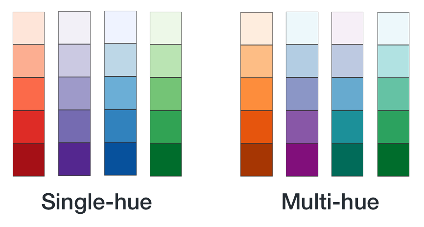
Source: http://www.venngage.com/
An invaluable resource for multi-hue color palettes is ColorBrewer2. Originally made for cartography, it’s become an industry standard for data visualization novices and experts alike. It allows you to choose between sequential and diverging schemes, and gives you the option to set the number of data classes (or “steps”) in the color scheme.
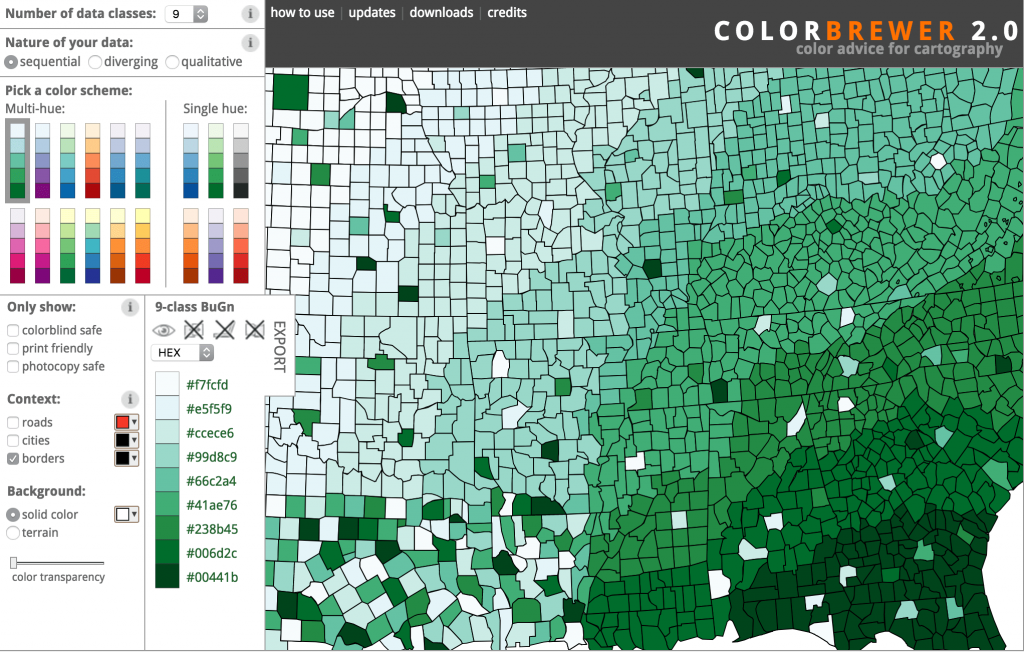
Source: http://colorbrewer2.org/
If you’re looking to build custom multi-hue schemes, check out Color Picker for Data. You pick the desired start and end values for your color scale, and the tool generates perceptually equal steps between those colors. It even allows you to preview the generated palette on a map with a sample dataset.
Indicate groupings with categorical color schemes
If you’re not using dashboard colors to encode value, you can use them to indicate groupings—to tell users which data elements belong to which categories.
The goal here is to find colors that are “optimally distinct”—colors that are easy to distinguish from one another that have approximately the same lightness and chroma level.
Anyone who has ever tried to build this kind of color palette from scratch will tell you that it’s near impossible. It’s a challenge to come up with a palette of five to six readily distinguishable colors that doesn’t look garish.
Luckily for us, some brilliant visualization designers have built tools that create such palettes for us. The most flexible is a tool called I Want Hue, which allows you to designate the number of colors you need and spits out the resulting palette in JSON, JavaScript, and CSS.
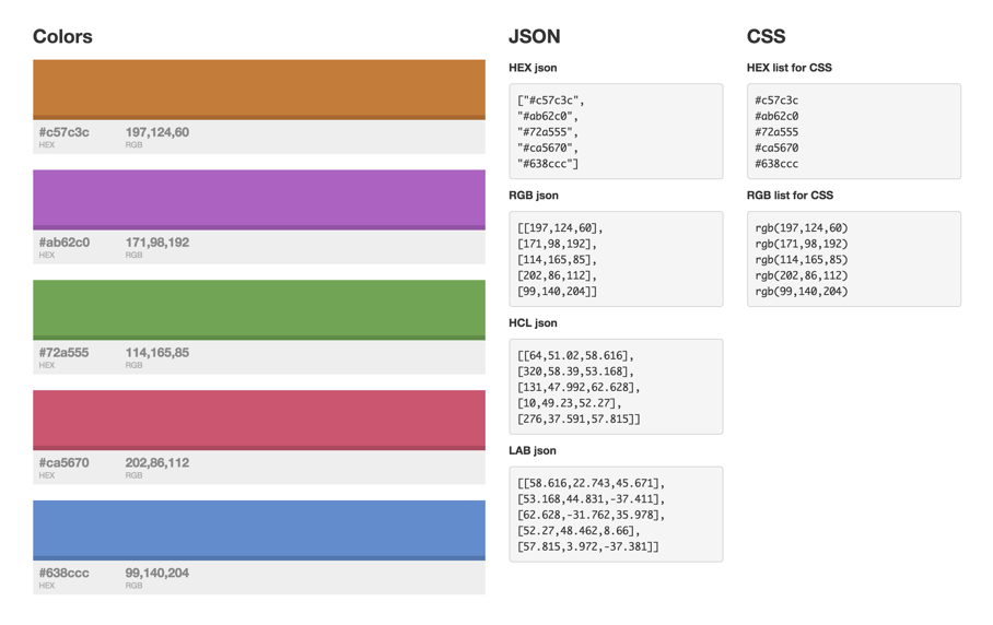
Source: http://tools.medialab.sciences-po.fr/iwanthue/index.php
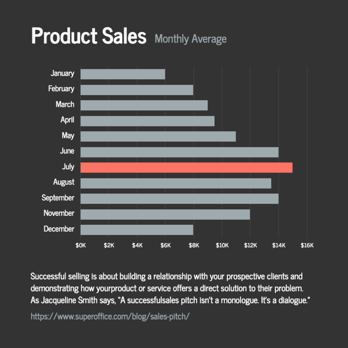
Highlight key information by contrasting bright, saturated hues with light greys
Besides using color to encode properties of our data, we can use color to highlight key data points to help end users understand the data. Reserve the brightest, most saturated colors for only the most important information, and use less saturated colors for less important information.
Source: https://venngage.com/templates/charts
Even better, you can apply subtle greys to any supporting data to push that information into the background, allowing the key points to command users’ attention. This is the single simplest way to reduce visual clutter in particularly complex dashboards.
Dashboard Color Scheme Examples
Choosing the right color scheme for your dashboard is essential to communicate data effectively and enhance user experience. Here are examples of color schemes specifically designed for popular platforms like Excel, Power BI, and Tableau.
Excel Dashboard Color Schemes
Excel provides various options to create custom color schemes that enhance data visualization:
- Neutral Palettes: Excel dashboards often use neutral palettes with soft grays, blues, and greens, which help make the data readable and prevent visual fatigue. For example, using light gray backgrounds with dark blue or green text makes the data stand out without overwhelming the user.
- Conditional Formatting Schemes: Excel allows the use of conditional formatting to apply color schemes dynamically based on data values. A common approach is to use a red-yellow-green (traffic light) color scheme to indicate low, medium, and high values respectively.
- Monochromatic Schemes: Monochromatic schemes use different shades of a single color to display data. This is useful for focusing on a particular metric without adding unnecessary visual complexity. For instance, various shades of blue might represent different ranges in sales performance.
Power BI Dashboard Color Schemes
Power BI offers advanced customization options to create compelling dashboards:
- Divergent Color Scales: Power BI supports divergent color scales that help show differences and ranges in data, such as profit margins. For example, a scale might use deep red for negative values and dark green for positive ones, with shades in between representing the gradation of data.
- Brand-Aligned Color Schemes: Power BI allows you to use custom themes that align with your brand colors, ensuring consistency across corporate communications. This is particularly useful for organizations that want to maintain a unified look and feel across their dashboards and reports.
- Sequential Color Schemes: Sequential color schemes in Power BI use gradients to represent ordered data, such as temperature changes over time or financial growth. For example, a light-to-dark blue gradient could represent a low-to-high sales growth range.
Tableau Dashboard Color Schemes
Tableau provides a range of color palettes designed to enhance data visualization:
- Tableau Default Palettes: Tableau offers a set of built-in color palettes specifically optimized for data visualization. For example, the “Tableau 10” palette features ten distinct colors that are color-blind friendly and designed to work well together, ensuring that dashboards are both visually appealing and accessible.
- Heat Map Color Schemes: Tableau’s heat map color schemes use colors to represent data density or intensity. For example, a gradient ranging from light yellow to dark red can indicate increasing values, such as the number of transactions per region.
- Custom Categorical Palettes: Tableau allows users to create custom categorical palettes, which are particularly useful for visualizing distinct categories like product types or customer segments. These schemes can use vibrant colors like orange, blue, and green to differentiate categories clearly.
Use Third-Party Tools to Find Dashboard Color Schemes
You don’t have to be a designer to come up with gorgeous dashboard color schemes. Use free third-party tools like the Adobe Color Wheel and Color Brewer to find dashboard colors that complement your accent color. Combine these into an eye-catching palette.
As you determine your color palette, keep in mind that different devices may display the same color value differently. Screen resolution, algorithms, and other factors impact how users will see a color on their particular device and screen. Test your dashboard colors on a variety of devices and screen sizes to ensure the colors you select are consistent across most screens.
It’s easy to make a great-looking dashboard using these basic principles of design. Your customers won’t even know that they’re looking at a branded dashboard. Nigel Derbyshire of FMP commented that in their application, “our customers are seeing our embedded analytics module as a feature of our product. It looks like our product and they don’t know they are using third-party software.”
Another great resource for developers who want to hone their design chops: Universal Principle of Design, by Lidwell, Holden, and Butler. If you’re interested in color theory and strategy, this book a must-have.
Dashboard color schemes may seem complicated, but if you start here you’ll be on the right path. And once you’ve decided on a color scheme, use these dashboard color strategies to guide the colors you choose for your data visualizations.
Final thoughts
We all recognize the aesthetic role of color in data visualizations, but its power as a communication tool should not be overlooked. Leverage these techniques to design dashboards that are as meaningful as they are beautiful.

The Definitive Guide to Dashboard Design
Download Now: