When and Why to use Heat Maps
What is a Heat Map?
When you hear the term “Heat Maps”, what comes to mind? Do you immediately think of something related to financials? Or are you drawn to forecasts you’ve seen on weather networks? Maybe you’re an out-of-the-box thinker and think of website tracking and tools to optimize conversions?
By definition, Heat Maps are graphical representations of data that utilize color-coded systems. The primary purpose of Heat Maps is to better visualize the volume of locations/events within a dataset and assist in directing viewers towards areas on data visualizations that matter most.
Heat Maps for Data Visualizations
But they’re much more than that. What many people don’t realize, is that Heat Maps can be applied to a handful of data visualizations. Because of their reliance on color to communicate values, Heat Maps are perhaps most commonly used to display a more generalized view of numeric values. This is especially true when dealing with large volumes of data, as colors are easier to distinguish and make sense of than raw numbers. However, Heat Maps are multifaceted and can also be used in more literal senses, for example, to showcase ‘hot and cold’ (density) zones on a map.
Heat Maps are extremely versatile and efficient in drawing attention to trends, and it’s for these reasons they’ve become increasingly popular within the analytics community, but that’s just the tip of the iceberg as to why. While other data visualizations must be interpreted – either by analysts or business users – Heat Maps are innately self-explanatory. The darker the shade, the greater the quantity (the higher the value, the tighter the dispersion, etc.). When existing data visualizations are paired with Heat Maps, their ability to rapidly communicate key data insights to the viewer is greatly enhanced.
Heat Map Examples
Heat map adaptations involve the use of color-coded data visualizations to represent the intensity of variables across a geographic area or within a dataset. These adaptations help in quickly identifying patterns, trends, and anomalies, making complex data more accessible and easier to interpret.
Retail Matrix
Imagine working as an analyst for a large, multi-national retail corporation that operates a chain of large department stores. You’re responsible for analyzing their flagship store, which is located in the downtown core of a large metropolis. What you’re interested in, is determining whether or not specific dates and times receive more traffic, in order to better allocate in-store resources.
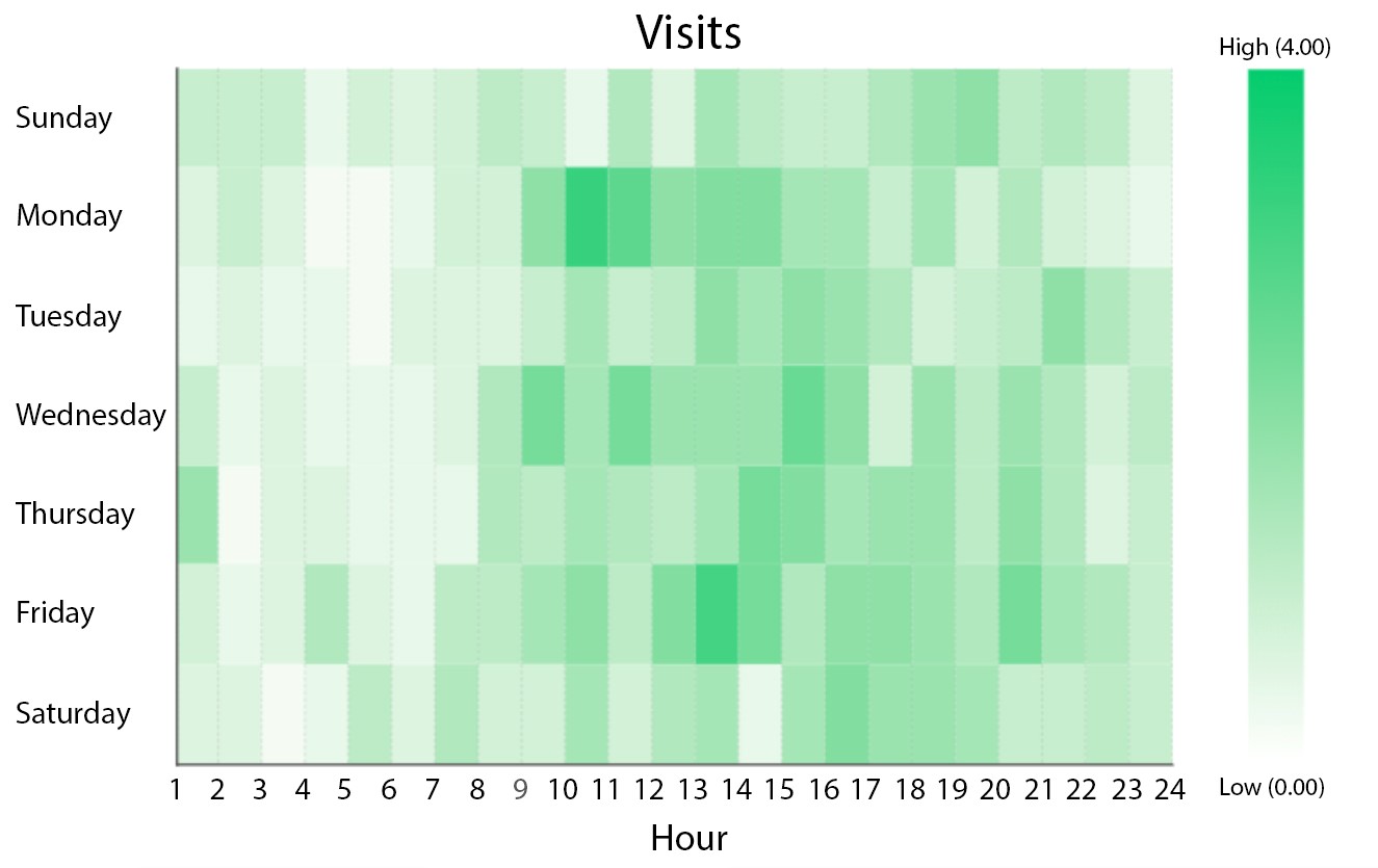
Figure 1: Retail Matrix in Dundas BI
This Heat Map is displaying the dates and times whereby the store is most heavily trafficked. With this, we’re able to immediately identify which dates and hours are busiest. For example, it’s clear that the store experiences an influx of traffic on Monday’s beginning at 10:00 AM, which slowly dissipates throughout the day. This pattern is repeated throughout the week, with minor daily variances (for example, Friday’s tend to experience prolonged periods of traffic, whereas Sunday’s tend to be lighter).
Armed with these insights, the retailer is better positioned to maximize their operations by better allocating key resources; for example, by scheduling additional Sales Associates during lunch rushes, or by scheduling inventory shipments during down periods earlier in the week.
Example: A retail matrix heat map can show the performance of different products across various store locations.
- Purpose: Identify which products are performing well in specific locations.
- Benefits: Helps in making informed decisions about inventory management and marketing strategies.
- Visualization: Color gradients indicate sales volume, with darker colors representing higher sales.
Manufacturing Diagram
Any manufacturer intent on improving their operations must be willing to analyze data relevant to their production bays. In addition to having access to crucial KPIs such as Production Count, Downtime, or Cycle Time, manufacturers must also be able to monitor the performance of their production bays in real-time in order to identify critical issues as they arise and intervene as required. After all, production bays are most effective when all components (machines, equipment, and labor) are firing on all cylinders.
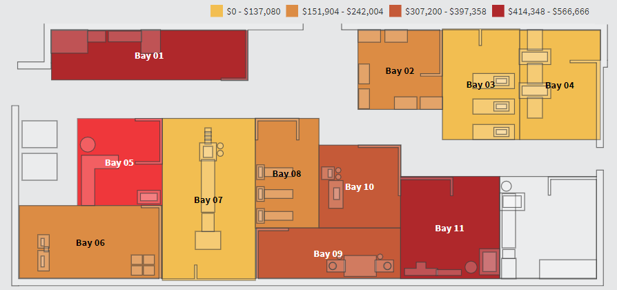
Figure 2: Manufacturing Diagram in Dundas BI
This Custom Diagram of a multi-bay production facility, is displaying which production bays are contributing the most defects from a monetary perspective. In this example, the darker the production bay, the higher the loss attributable to defects. It’s easy to immediately see that production bays 1 and 11 are producing defects at an alarming rate, while production bays 3, 4, and 7 are performing within their expected thresholds.
This rendition of a Heat Map is great to use on a high-level dashboard as it allows for at-a-glance monitoring of which production bays are in good condition, which require attention, and which are at risk. Once the statuses have been identified, the manufacturer is then prompted to perform deeper analysis and identify the root causes.
Example: A manufacturing diagram heat map can illustrate the efficiency of different production lines within a factory.
- Purpose: Highlight areas of high productivity and pinpoint bottlenecks.
- Benefits: Enables optimization of production processes and resource allocation.
- Visualization: Color-coded sections show efficiency levels, with red indicating areas needing improvement and green showing optimal performance.
Population Map
As mentioned earlier, Heat Maps work wonders on literal maps, because of the defined boundaries that are relevant to the data. In these scenarios, Heat Maps can be used to represent population density, per-capita income, average temperatures, and so on. Take the following Bar Chart for example, which features the populations of American states and Canadian provinces. It’s equally as difficult (if not more) to analyze as a Bar Chart, as you’d imagine it would be as a Table.
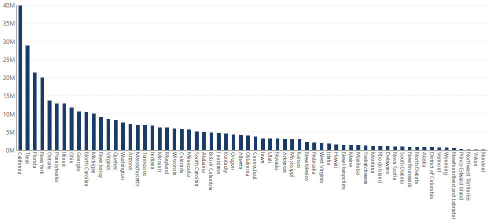
Figure 3: Population Bar Chart in Dundas BI
The best way to interpret this data is by using a Map visualization; specifically one that incorporates Heat Map components. The map leverages our knowledge of geography in place of text labels, and the colors attributed by the Heat Map, indicate approximate values.
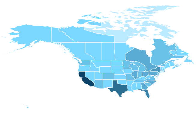
Figure 4: Population Map in Dundas BI
Example: A population map heat map can display population density across different regions.
- Purpose: Understand population distribution and identify densely populated areas.
- Benefits: Useful for urban planning, resource distribution, and public services management.
- Visualization: Varying shades represent population density, with darker shades indicating higher density.
PS – We actually have ANOTHER type of Heat Map that features the Map visualization, this one should set your existing Maps ablaze.
When to Use Heat Maps
Heat Maps are an incredibly versatile tool, applicable across a broad range of scenarios. Their value lies not only in their ability to visualize data effectively but also in their capacity to reveal insights that might otherwise go unnoticed. Below are several key situations where Heatmaps can be particularly useful:
1. Data Exploration and Pattern Recognition
- Identify Trends and Outliers: Heat Maps excel at highlighting patterns within large datasets. They make it easy to spot trends, such as areas of high activity or significant deviations, allowing users to quickly identify where further analysis is needed.
- Enhance Visual Clarity: When dealing with complex data, Heatmaps simplify the visualization process by using color gradients to represent values, making it easier to understand the distribution and relationships within the data.
2. Performance Monitoring
- Real-Time Data Monitoring: In environments where monitoring performance is critical, such as network operations centers or financial trading floors, Heat Maps provide real-time visual feedback on the status of key metrics. They allow for quick identification of bottlenecks or issues that require immediate attention.
- Efficiency Tracking: By mapping performance data, businesses can track the efficiency of processes over time. For example, in a manufacturing setting, a Heat Map could highlight areas where production is consistently slower, indicating where process improvements are needed.
3. User Behavior Analysis
- Website and App Optimization: Heatmaps are often used in digital marketing to analyze user behavior on websites and apps. They reveal how users interact with a page, showing which areas are receiving the most attention and which are being ignored. This insight is crucial for optimizing user interfaces and improving the overall user experience.
- Conversion Rate Optimization (CRO): By understanding where users are clicking or hesitating, businesses can make data-driven decisions to optimize conversion funnels, ultimately leading to higher engagement and conversion rates.
4. Geospatial Analysis
- Geographical Data Visualization: Heatmaps are particularly useful in visualizing geographical data. Whether it’s mapping customer locations, sales regions, or environmental data, Heat Maps help in identifying regional patterns and making informed decisions based on geographic trends.
- Risk Assessment and Management: In risk management, Heatmaps can visualize the geographic spread of potential risks, such as natural disasters or market fluctuations, enabling organizations to plan and respond proactively.
Why Use Heat Maps?
Heat Maps are a powerful tool for data visualization, offering numerous benefits that make them an essential resource for various industries and applications. Here’s why you should consider using Heatmaps:
1. Immediate Data Insight
- Visual Simplicity: Heat Maps use color gradients to represent data, making complex information more accessible at a glance. This visual simplicity allows users to quickly grasp patterns, trends, and anomalies without having to sift through extensive data tables or reports.
- Enhanced Understanding: By representing data in a way that is visually intuitive, Heatmaps help users identify relationships and correlations that might be overlooked in more traditional forms of data representation.
2. Improved Decision-Making
- Focus on Key Areas: Heat Maps direct attention to the most critical areas within a dataset by visually highlighting areas of high or low intensity. This focus enables decision-makers to prioritize actions based on data-driven insights, improving the effectiveness of strategies.
- Data-Driven Strategies: With the ability to quickly identify trends and outliers, Heat Maps support more informed decision-making processes. Whether in marketing, operations, or risk management, using Heat Maps can lead to better outcomes by ensuring that decisions are grounded in comprehensive data analysis.
3. Versatility Across Industries
- Broad Application: Heat Maps are versatile and can be applied across various fields such as marketing, finance, healthcare, and logistics. For example, they can be used to track customer behavior on a website, monitor financial performance, analyze patient data, or optimize supply chain operations.
- Customizable for Different Needs: Depending on the data and objectives, Heat Maps can be customized to highlight different aspects of the dataset, whether it’s geographic distribution, time-based trends, or performance metrics.
4. Enhanced User Engagement
- Interactive Features: In digital contexts, Heatmaps can be interactive, allowing users to hover over or click on specific areas to drill down into more detailed data. This interactivity increases engagement and makes data exploration more dynamic and informative.
- Usability in Reporting: Heat Maps are highly effective in reports and presentations, where they can quickly convey complex data to stakeholders. Their visual appeal and clarity help keep audiences engaged and ensure that key messages are communicated effectively.
5. Efficiency in Large Data Analysis
- Handling Large Datasets: Heat Maps are particularly useful when dealing with large datasets, where traditional analysis methods might be cumbersome. They can distill vast amounts of information into a single, easily interpretable visualization, saving time and reducing the cognitive load on users.
- Real-Time Data Monitoring: In environments where real-time data is crucial, such as network monitoring or financial trading, Heat Maps provide instant visual feedback on the status of key metrics, allowing for quicker responses to emerging issues.
Conclusion
Heat Maps are not confined to a single application or industry. Their ability to visualize data in a clear, intuitive way makes them an invaluable tool across various fields, from business analytics to geographic studies. By identifying areas of interest quickly and allowing for deeper exploration, Heat Maps empower users to make informed decisions and drive meaningful change.
Regardless of what base visualization is used, with Heatmaps, the end result is a data visualization that quickly communicates its data to the viewer, using easy-to-understand color gradations.