Data Visualization Solutions
AI-First Data Visualization Tools Integrated for Real-Time Insights
Logi Symphony and our data visualization tools deliver powerful, AI-first charts, diagrams, and graphs that can be integrated with your workflows. insightsoftware visualization solutions turn real-time data into stunning white-labeled dashboards and predictive charts for instant action.
"*" indicates required fields
Create Stunning Visualizations With Our Tools

Business Intelligence & Analytics
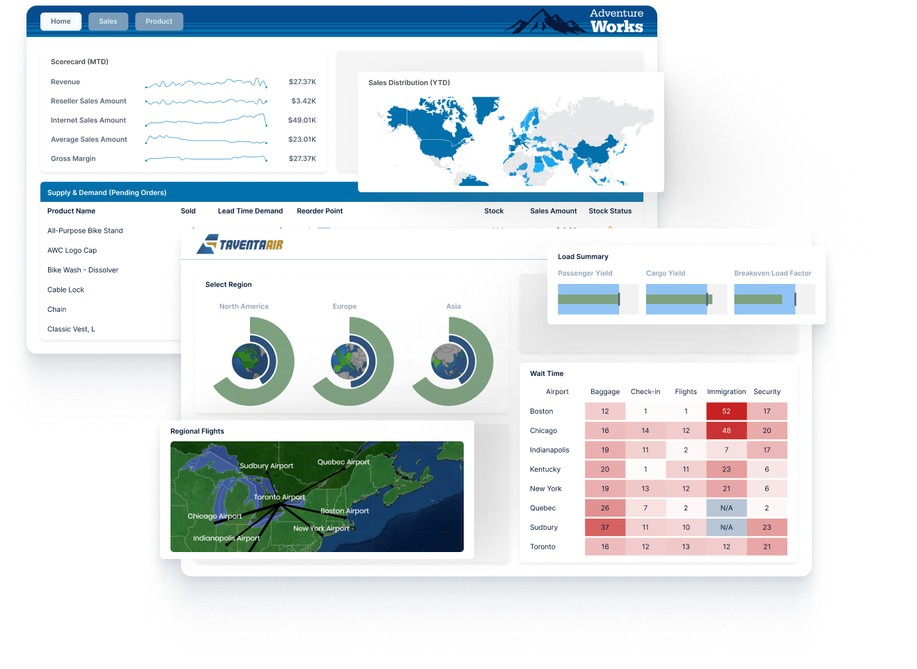
Logi Symphony is modern BI software that allows software vendors and enterprises to augment any application with AI-infused analytics
AI-First Visualization: Custom & Real-Time
Logi Symphony redefines what is possible in data visualization and BI, delivering 85+ AI-ready controls (charts, gauges, maps, and diagrams) that you can customize through thousands of properties. Stream real-time data from any source, apply predictive formulas, and embed dashboards in your apps for instant insight.

We Connect to 200+ Data Sources


AI-Powered, Real-Time Visualizations & Smarter Insights
Turn real-time data into clear, AI-guided insights. Build predictive dashboards, spot trends instantly, and surface actionable insights from within any app, so decisions stay ahead of the curve.

Our AI-connected data visualization tools bring data to life by answering your questions with precision, offering clear and actionable insights. Integrate with popular LLMs/SLMs, such as GPT-4o and BERT, to receive grounded insights from your data. Enjoy worry-free operation with robust data security measures, including encryption and access controls, ensuring your information remains protected while leveraging AI to enhance your visualizations. Whether you’re a data scientist, analyst, or business leader, our data visualization solutions empower you to harness the full potential of your data.
Go beyond raw data with advanced formulas that provide data augmentation, in-depth calculations, and additional analysis to uncover hidden patterns and trends. Utilize our extensive library of formulas, including statistical functions, financial models, and machine learning algorithms, to craft the precise visualizations you need. Our robust data visualization tools provide comprehensive, real-time insights, enabling better decision-making and strategic planning. Empower your business with the clarity and precision needed to stay ahead in an increasingly data-driven world.
Even the best data visualizations are ineffective if the information is outdated. It’s crucial to ensure that all visualizations are real-time so they can provide benefits such as immediate insights, faster response times, and up-to-date information for timely decision-making. We enable businesses to respond quickly to changing conditions and make informed decisions based on the latest data with any visualization. Additionally, real-time visualizations can help identify trends and patterns that might be missed with static data, giving you a competitive edge.
Data Visualization Software Built for Any Role or Industry
Data Analysts
Quickly surface insights that matter. Drag and drop visual controls, let AI recommend the right chart, and drill from summary to detail in seconds. Logi Symphony accelerates analysis and sharing so analysts deliver answers before stakeholders even ask.

Business Users
Explore live metrics without a data team. Ask natural language questions, get charts back instantly, and follow guided highlights that explain what changed and why. See the story, act fast, and skip the spreadsheet shuffle.

Web Users
Give visitors interactive dashboards they can trust. Logi Symphony embeds in portals and apps, loads fast on any device, and keeps viewers engaged with filters, tooltips, and export options for deeper dives.

Developers
Build pixel-perfect analytics into products with our SDK, APIs, and open standards. Theme every element to match your UI, stream data in real time, and rely on enterprise security that passes the strictest audits.

Healthcare
Unify EHR, device, and claims data in one secure view. Track patient flow, staffing, and clinical KPIs in real time while AI identifies anomalies and predicts resource needs. Improve outcomes and compliance without extra clicks.

FinTech
Visualize trades, balances, and risk in milliseconds. Logi Symphony streams tick data, flags fraud patterns, and alerts teams before losses mount. Built-in governance keeps regulators and customers confident.

Manufacturing
Unify plant data, sensor feeds, and ERP reports in one dashboard. See live throughput, inventory, and quality KPIs, then let AI flag anomalies and predict maintenance needs. Faster insight keeps production lines running, waste down, and margins up

Science & Technology
Aggregate experimental, sensor, and SaaS data in unified dashboards. Spot trends in real time, model outcome scenarios, and share findings with collaborators on any device. Accelerate discovery while keeping IP secure.
Featured Blogs
Read and watch the latest resources for finance and operations professionals looking to get inspiration on how to improve their processes.


More Data Visualization Resources
- History of Data Visualization
- How to Choose the Right Visualization for Your Data
- Data Visualization Best Practices for Finance
- Go Beyond Data Visualization to Data Storytelling
- Let Real-Time Data Visualization Drive Your Storytelling
- How AI Can Help Your Data Visualization?
Data Visualization Software FAQs
As the name suggests, data visualization is the process by which quantitative or qualitative information is translated into visual representations (e.g. charts, graphs, maps, dashboards, etc.). These visual representations make it faster and easier for users to explore, understand, and interpret patterns, trends, relationships, anomalies, and overall performance structure. In essence, data visualization turns complex information into insightful visual stories.
The most common types of data visualizations are:
- Comparison (bar chart, line chart)
- Distribution (histogram)
- Composition (pie chart, stacked bar chart)
- Relationship (scatterplot)
Each of these corresponds to an analytical question they help answer, such as “How much of the whole does this represent?” (composition).
Learn more about the various types of data visualizations here.
The goal of data visualization is to distill complexity by quickly and intuitively revealing insights like patterns, trends, opportunities, and threats. Many people are primarily visual learners and interpreters, so data visualization helps accelerate understanding to improve analysis and inform key decisions.
Humans tend to detect visual patterns faster than textual or numeric formats. Because of this, data visualization enhances our own pattern recognition (e.g. trends, clusters, etc.) and supports evidence-based decisions instead of gut instincts. It also improves communication across teams via shared visual context and speeds up the detection of outliers for faster responses. All of these contribute to more efficient, agile, and effective teams and organizations, which is a key competitive advantage.
There are several concrete business advantages to improving your data visualization capabilities:
- Enables faster, more confident decisions via accelerated insights.
- Facilitates better alignment via shared dashboards that create a single source of truth.
- Enhances productivity via embedded analytics (like Logi Symphony) to deliver insights within apps that users already work from.
- Increases operational and financial agility via real-time discovery of patterns to act more quickly.
The simple act of translating raw or complex data into easily understandable visual formats makes it faster and more intuitive to identify trends, patterns, and anomalies. This, in turn, provides clarity for more informed and strategic decision-making, as well as better tracking of performance metrics and more effective adjustments based on actionable insights. Data visualization also improves communication by creating a shared language where everyone can understand business performance.
Introducing interactive elements to your data visualizations enhances exploratory power, enabling users to drill into patterns from broad trends to specific data points. Interactive features like writeback (offered by Power ON and Vizlib) close the loop within dashboards, seamlessly facilitating workflow integrations. Lastly, interactive data visualizations can leverage in-app commenting, notes, and workflows (like Vizlib) to create context-rich collaborations between team members.
Our pre-built starter templates, intuitive drag-and-drop builders, and quick embeddings via Logi Symphony make it easy for non-technical users to build functional interactive dashboards in their first working session. Whether a developer or business user, our data visualization tools are easy to use and offer fast ROIs, so you don’t have to wait on IT bottlenecks to build or update charts and designs.
We recommend using the following table as a starting point for finding the right data visualization:
| Goal | Visualization |
| Comparing values | Bar/line charts |
| Showing a distribution | Histograms |
| Showing a makeup/composition | Stacked bars, pie chart, treemaps |
| Showing correlation | Scatterplots |
Our data analysts also suggest leaning on the side of simplicity rather than complexity to avoid overwhelming clutter. Logi Symphony and Vizlib both offer pre-built and tested chart libraries that adhere to industry best practices, so you can get started faster and more effectively.
Several characteristics define “good” data visualizations, but all work together to make it clear, accurate, and purposeful:
- Avoid distortions and misleading scales
- Prioritize context with axes, labels, and baselines
- Encourage exploration without distraction
insightsoftware data visualization tools embed these principles in our default styles and templates so you don’t have to spend as much time wrangling formatting and colors.
We recommend using color meaningfully and sparingly, such as to highlight an outlier or important data point. You should also make sure that the contrast of your chart meets accessibility standards, so users who have color blindness can still use it effectively. Lastly, sticking to distinct color palettes for categorical comparisons and sequential or diverging schemes for gradients will help visually tie elements together, and can even be combined with your brand’s colors for a more professional and seamless look.
When creating data visualizations, avoid 3D effects or heavy styling that obscures the data and makes it harder to decipher. You should also avoid truncated axes that exaggerate differences, as well as overloaded dashboards that lack focus. If you’re not sure about a design choice, ask yourself, “Does this clearly convey the point I want it to?”
Now that we understand data visualization and what it is, what are the tools that help modern businesses enhance their visualization practices? Data visualization tools are software solutions that facilitate the data connections, transformations, and actual rendering of visuals and dashboards. For example, our integrated stack to support data visualization includes:
- Simba drivers for enterprise-grade data connectivity
- Vizlib for advanced Qlik Sense visuals (and interactivity)
- Logi Symphony for embedded analytics across your work apps
A major recent trend in this space is the proliferation of white-labeled embedded analytics, using tools like Logi Symphony. This allows organizations to display charts and graphs that are branded with their own logos and colors across a variety of other systems, like their ERP or data warehouses. Full-cycle collaboration and writeback capabilities within dashboards (such as those offered by Vizlib) are also growing in popularity, as is the AI-driven automation of updates, scheduling, insights, and more.
We recommend evaluating tools based on core decision factors, such as:
- User Experience: Can non-technical users easily create dashboards using intuitive features like drag-and-drop or pre-built templates?
- Data Connectivity: Does the data visualization tool support your data sources (e.g. cloud apps, databases, files, etc.)?
- Branding/White-Label Flexibility: Can you customize the appearance of your data visualizations to match your branding?
- Performance: Does the tool slow down with larger data volumes, concurrency, and other scaling expectations?
- Collaboration: Are users able to discuss, annotate, or act within dashboards to align on insights and findings?
- Security/Governance: Does the software support security features like role-based access, SSO, audit trails, and more?
Using these core factors, it becomes easier to match your business goals to the right solution. insightsoftware platforms like Vizlib and Logi Symphony are designed to have these key components baked in from the start, instead of being treated like an afterthought or add-on.
MongoDB requires connectors to integrate with data visualization tools, so you’ll need to use a platform like Simba. Simba’s ODBC/JDBC drivers allow SQL-style queries against MongoDB directly from data visualization platforms like Logi Symphony or Qlik Sense.
Because of Simba’s enterprise-grade data connectivity features, any insightsoftware platform can be used seamlessly with MongoDB, such as Logi Symphony. Qlik Sense is another popular data visualization platform, but it can struggle with more advanced charts and integration with MongoDB, so we recommend using Vizlib with Qlik Sense. Beyond these options, any BI tool that supports ODBC/JDBC can use Simba-based MongoDB drivers to integrate and connect your platforms.
Logi Symphony is ideal for embedded white-label data visualizations (full control over UI branding and theming) without building from scratch. Vizlib is your go-to data visualization platform to extend Qlik’s capabilities for better collaboration, writeback, planning, and more. Simba is a great choice for teams already using other data visualization tools but are looking for compatibility with MongoDB, SQL, Workday, and other data sources.
Our white-label embedding is unmatched, providing businesses full control over the UI’s branding and theming without needing to build dashboards from scratch. Our solutions are designed to integrate with each other and your existing tools like ERPs and data sources, offering unparalleled collaboration via writeback, workflows, input forms, approvals, and more. insightsoftware platforms are built with enterprise performance in mind for extensibility across platforms and data sources. Lastly, our data visualization tools come with security, multi-tenancy, and scheduling built in for scalable governance that builds peace of mind.
There are two aspects to this — practicality and possibility. Practically, it’s best to limit the number of data points in a visualization, as both human perception and browser capabilities have limits. However, our visualizations can still handle larger data sets using techniques like lazy loading, paging, or hierarchy-based drill-down. Always consider your audience and prepare data to align with best practices for the chosen visualization.
Vizlib and Logi Symphony offer seamless collaboration features like in-context commenting, collaborative writeback, annotations, secure sharing, subscriptions, threaded discussions, approval workflows, audit trails, and more.
Yes. Logi Symphony offers full white-labeling to control your visualizations’ themes, CSS, branding elements, and layouts. All of this ensures that embedded analytics and charts feel native to your other applications and tools.
Yes. Logi Symphony is designed to quickly and easily embed your data visualizations via JavaScript or iFrames, seamlessly integrating into your UI and security model.
Our tools go beyond raw data by offering advanced augmentation, calculations, and additional analysis. With a library of formulas, you can craft the visualizations you need to extract maximum value from your data.
Our solutions prioritize data security, ensuring that your information remains protected while leveraging advanced AI and real-time data integration features. By providing an entire Business Intelligence & Analytics platform, we provide a secure environment for your data. Additionally, our solutions offer seamless integration with various data sources, enabling you to make informed decisions quickly and efficiently.
Our data visualization can work with many data sources through several approaches:
- Out-of-the-box connectors: Seamlessly integrate with all major data sources, including traditional databases, big data, flat files, and streaming web data.
- Plugin connectivity: Utilize standards-based technologies like Simba for expanded connectivity.
- Programmatic retrieval: Fetch data programmatically for custom solutions.
Yes. Logi Symphony enables you to schedule exports (PDF, Excel, images, etc.), trigger alerts, and distribute them automatically. This eliminates manual handoffs and makes sure that your insights are delivered in a timely manner to all relevant stakeholders
Yes. Our tools offer extensive customization options, allowing you to tailor visualizations to meet your unique requirements and match your brand’s style.
Our solutions are open and flexible platforms that allow for the creation and addition of newly imagined data visualizations.