Data Visualization Tools
Data visualization tools take analyzed data and present it in a way that can be easily understood and communicated in presentations, reports, and marketing materials. They allow businesses to gain key insights into many aspects of their operations.
Graphs and charts can be 2D, 3D, or animated.
- 2D tools portray data in two dimensions. Most tools are 2D, and they often offer the “cleanest” and most simple representation.
- 3D tools can be more complex due to the extra dimension involved, and shouldn’t be used unless necessary. They can allow for more advanced analytics than 2D tools where appropriate.
- Animated tools can be navigated to cycle through different data sets or to offer multiple views of one data set through different visualizations focusing on different aspects of the data.
See examples of these tools and their uses in our data visualization examples page.
Tools can be individually coded by in-house developers, purchased as bolt-on tools from external developers, or combined in a platform.
Data Visualization Platforms
Data visualization platforms combine the benefits of internally and externally developed tools. There are also a number of pain points solved with the use of such a platform. While tools developed in-house can be better suited to a company’s needs than externally-developed “bolt-on” tools, the cost and time required to develop them can be prohibitive and delay progress. Companies often choose to sacrifice the bespoke customization features offered by in-house tools to save time and money.
Data visualization platforms solve this problem by offering far more features and customization than traditional bolt-on tools. Developed externally, these platforms platforms grant a holistic view of data sets that enable easier analyzing and reporting of data.
How to Use Data Visualization Tools
While these tools are a powerful addition to any business, they must be used correctly in order to add value.
Using the right tool for the job
It’s important that you use the appropriate visualization. Certain visualizations are better suited for certain situations and forms of data presentation than others.
For example, people often use icons to represent multiple parts of a whole. When doing so, it’s best to display a percentage sign or equivalent figure beside the final icon. Still, this tool is best suited to use in advertising materials like brochures.
![]()
For more formal settings like presentations, a pie chart is best.
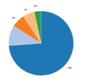
An icon could be used to do the same thing, but without clear labeling, it’s just not as interpretable as a pie chart, nor is it as appropriate for a work setting.
![]()
See more examples of choosing the right data visualization for your data.
Keep it simple
The best visualizations are easy to interpret at a glance. The viewer should be able to understand what they’re seeing with no ambiguity. While it’s tempting to use all the visualizations at your disposal, don’t overburden the viewer with information.
The icon above doesn’t show the values clearly, and while it may be aesthetically pleasing, it simply doesn’t get the job done as well. Avoid the temptation to use overly-flashy visualizations just for the sake of it—prioritize simplicity and clear communication first.
Integrate Tools into Marketing
While visualization tools are commonly used for internal business intelligence in stakeholder meetings, they can also be successfully integrated into your marketing materials.
Use data visualizations in your blog posts, business wikis, printed materials, video promotions, etc. Doing so will catch the eye of your customers and make them more interested in the information you’re trying to communicate. Graphic design doesn’t need to be “empty” imagery—use eye-catching data visualizations to engage and educate your customers at the same time.