Top 5 EPM Reporting Templates (+ How to Get Started with EPM)

Enterprise Performance Management (EPM) provides users throughout your company with vivid, up-to-the-minute details about the key metrics that drive your organization’s success. That might be a sales performance dashboard for your Chief Revenue Officer, a snapshot of “days sales outstanding” (DSO) for the A/R collections team, or an item sales trend analysis for product management. It could also include a marketing dashboard that summarizes response rates for recent campaigns, or even a traditional financial report such as a year-to-date profit and loss (P&L) with year-over-year variances.
For virtually everyone in your organization, EPM reporting can be a powerful tool for defining clearly measurable targets, monitoring performance, and bringing your data to life. EPM gives you up-to-the-minute information to help people throughout your company make smart decisions quickly.
For C-level executives, EPM provides immediate, high-value feedback. At just a glance, the CEO, CFO, or other internal stakeholders can get a clear picture of what’s happening throughout the organization and whether or not your team is on target to meet key objectives.
EPM, Simplified
Although the potential of EPM is great, many of the EPM tools on the market have a reputation for being technically complex, difficult to use, and costly to maintain. Oracle Hyperion and Oracle PBCS are valued for their robust capabilities, for example, but those typically come at a high cost.
That cost isn’t limited to staff resources and hefty license fees. Creating reports from the ground up can be a lengthy, labor-intensive process that’s usually outsourced to the IT department. In many organizations, that means logging an IT ticket, communicating your needs, and waiting until someone has time to respond to your request. This creates an opportunity-cost when decision makers have to wait for the reports they’ll be using to track performance metrics.
Although many EPM tools require extensive training and a high level of technical expertise, that’s not necessarily true in every case. CXO Software, for example, is remarkably user-friendly, allowing users in the finance department to develop powerful, flexible reports without help from the IT department.
CXO Lunch and Learn: Introduction to Workflow
Download NowWhen you combine that ease-of-use with a collection of pre-built templates, you gain the ability to get up and running very quickly with EPM. That translates to tangible business results in a short period of time. It also means greater business agility, as you can modify your reports quickly and easily, adapting to changing conditions rapidly.
The CXO Showcase Gallery offers a variety of EPM templates, including front-page storyboards, with key metrics intuitively displayed and image redirects that lead to more detailed reports. You’ll also find things like an FTE trend analysis, a regional sales performance dashboard, and a variety of P&L formats.
The finance experts at CXO Software have tailored each template to a specific metric, workflow, or strategic priority. Without requiring any input from IT, these templates fulfill the majority of reporting requirements for most organizations. This translates to immediate business value for customers using CXO for the first time.
As they get to know just how powerful CXO’s EPM capabilities are, customers begin to customize those templates and build out their own reports and dashboards from scratch. Customization is so easy that real users can create their own templates and share them with the insightsoftware community. CXO users can access those templates for free, benefiting from a wealth of best practices.
It’s hard to overstate how much easier reporting becomes with access to purpose-built templates automatically populated with data. Self-service reporting is here and ready for you to try. To get a better sense of what templates can do, consider some of these top examples:
Top 5 EPM Reporting Templates
Sales Performance by Location
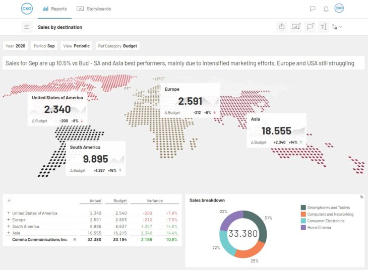
Although it appears quite simple on the surface, this Sales Performance by Location template offers a remarkably rich view of sales performance. The report breaks down sales by location and product, allowing users to drill down to the details that make up any metric on the screen. Filtering specific locations or products is easy, making this report appropriate for any company that wants to gain a deep understanding of sales performance across multiple territories.
Management Information Dashboard
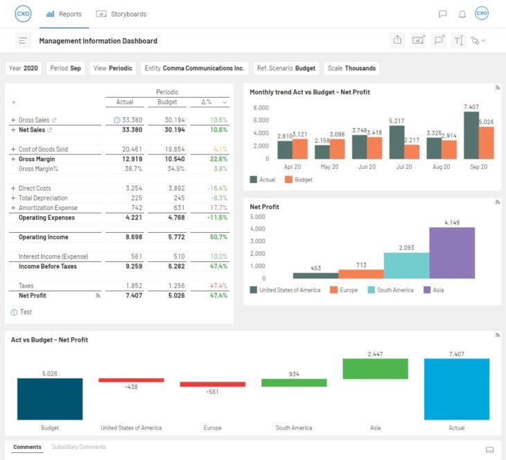
Often, the best reports are ones that condense massive amounts of information into an easily accessible, quickly digestible format. This Management Information Dashboard template does exactly that, integrating the most important KPIs and creating a single source of truth for understanding enterprise performance. A smart design combined with straightforward visualizations allow this template to communicate volumes. For C-level executives, this is often a preferred format.
KPIs Overview
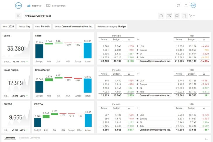
This KPIs Overview template offers another high-level perspective, ideal for line-of-business managers or top executives. In this case, KPIs are presented from a different perspective. Users can pick the three KPIs they need to track most closely. The report displays those metrics at increasing levels of granularity, concluding with dynamic waterfall charts that incorporate drillable tables. With this report, users can tell with just a glance whether their KPIs are trending upward or downward. At the same time, they have easy access to details, so if they want to see what’s driving those trends, the information is right at their fingertips.
Multiple Bar and Line Charts
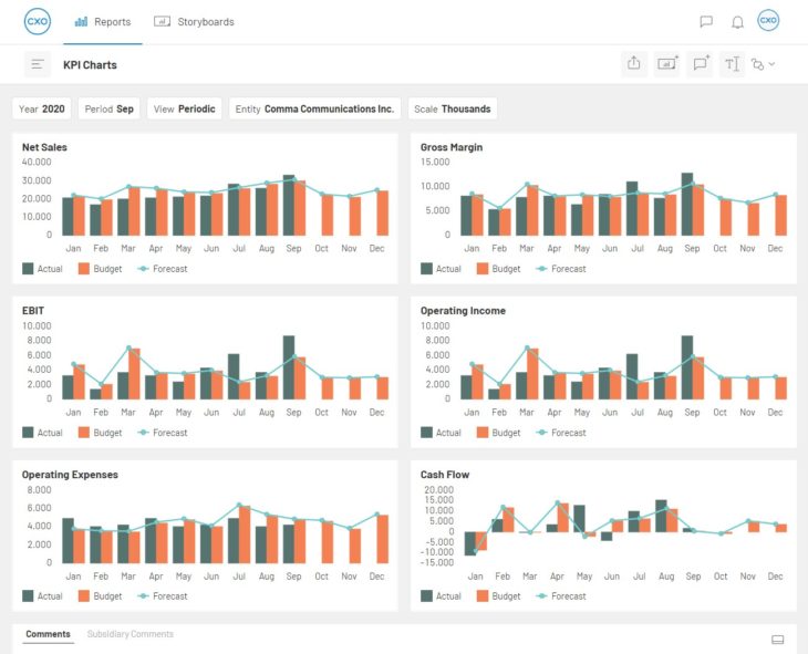
It can be difficult to quickly identify patterns within complicated graphs with lots of data and broadly distributed values. Sometimes, a simple trend line can offer insight. Multiple bar and line charts are an effective way to identify and display trends in CXO because they allow a user to combine accounts, members, and dimensions. By mixing line charts and bar charts, you can display up to 6 axis-frames in one report.
The graphs in the example above are driven by the Point of View (POV) the user chooses in the dashboard control panel. This flexible POV option results in a dynamic report that can easily be adjusted to expand, zoom in, or shift the focus for analysis purposes. It’s this kind of intuitive insight that earns the multiple bar and line template the number 4 spot in our top 5.
Profit and Loss With Trend Analysis
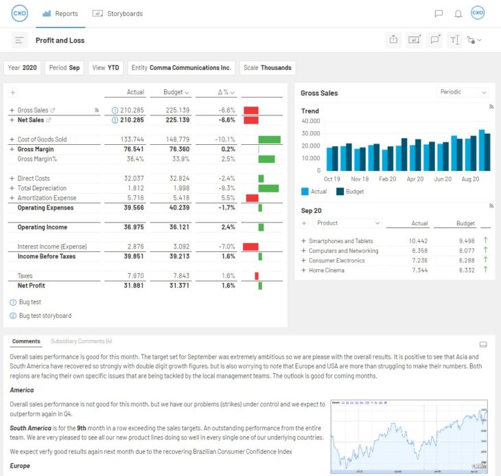
The Profit and Loss (P&L) with Trend Analysis template provides a more detailed view, allowing users to select any account on the P&L statement for a complete trend analysis that compares actual results, budgeted amounts, and last year’s numbers. Users can track the pulse of enterprise performance, gaining instant access to data and analysis that might otherwise require extensive research hours to collect.
Getting Started With EPM Reporting Templates
Interactive EPM provides far more robust and flexible access to information than static reports. EPM offers dynamic views of up-to-the-minute information. They bring the data to life, helping decision makers fully understand what is happening in the business in real time.
CXO’s pre-built templates make it remarkably easy to build best-in-class reports. Now that you have seen some examples and understand the benefits of an EPM strategy built around templates, let’s talk about how you can get started and begin taking advantage of this powerful strategy in your organization:
Step 1: Choose Your Data Sources
CXO can automatically access information from group companies to produce consolidated financial reports. With the CXO Data Warehouse Adapter, you can access ERP data, planning and budgeting numbers, or external information. This gives you tremendous flexibility to build robust reports, providing a complete overview of the most important information for your organization’s decision makers.
Step 2: Choose Reporting Templates
The quickest way to get started with interactive reporting is to work with pre-built templates created by domain experts. Typically, these templates incorporate best practices for design as well as performance monitoring, and they’re explicitly designed to handle the most common reporting needs. Find the models that look and function the way you want. You can also consider building customized reports from the ground up.
Step 3: Select the Dimensions
Multi-dimensional reporting provides a highly interactive experience for users. Start by selecting the various dimensions that will be available to users, such as year, month, entity, or product line, for example. That lets users quickly switch up the information they’re viewing. The key is to choose the most important dimensions for decision makers, particularly those that enable comparisons between adjacent periods, business units, product lines, or sales channels.
Step 4: Create Multiple Points of View
Much like dimensions, users should be able to view the same information in multiple different contexts. For instance, the section of the report that tracks net sales can indicate how those sales compare to the current budget or the previous year. The ability to reframe information in various contexts quickly and easily is one of the most powerful features of an interactive EPM report.
Step 5: Highlight Information in Tiles
Tiles are bold blocks of information that combine all the details necessary to understand a single key performance indicator like Gross Margin Percentage, Net Profit, or Working Capital. Tiles function as a graphical highlight, calling attention to essential information that gives decision makers an immediate and powerful perspective on organizational performance.
Step 6: Drill Into the Data
Unlike static reports that only display a snapshot of information, dynamic reports and dashboards can present a wide range of information in one place. Moreover, they’re constantly updated as new information becomes available. On the surface, they condense a lot of information into a digestible format. Underneath that surface, however, is a vast amount of data that went into calculating specific metrics. With dynamic reporting, users in your company have an entry point from which they can explore virtually any aspect of performance. Ideally, your reporting tools should make that exploration process as simple and intuitive as possible.
Intelligent Reporting Solutions CXO
Download NowStep 7: Translate Information Visually
Visualizations bring data to life, providing tremendous value to the users in your organization. Let’s face it: it can be difficult to identify patterns, outliers, and other significant information when numbers are simply presented in rows and columns on a computer screen or mobile device. Visual displays such as charts, graphs, trend lines, and indicators add meaning and perspective, helping users make sense of the information quickly, easily, and intuitively.
Step 8: Create a Storyboard
By itself, a single report rarely tells the whole story. To understand the big picture of enterprise performance, users need multiple points of information, often provided as a series of reports. After following the steps above to create individual reports, group together reports relevant to one another in what’s known as a storyboard.
Storyboards create a seamless narrative that places individual KPIs and reports in the context of overall performance. They enhance the meaning and value to the people who rely on that information, giving them a better understanding of what is happening in the business as a whole. For each storyboard, be sure to include the highly relevant reports, while excluding all others. In addition, it’s helpful to organize the reports so that each one builds upon the others, painting a vivid picture for decision makers.
Step 9: Always Be Adapting
The final step in an interactive EPM reporting strategy is to always be adapting. As businesses grow and change, their needs evolve. Consider how the onset of the COVID-19 pandemic affected revenue, supply chains, and production capacity, for example. Business executives throughout the world were called upon to respond quickly to that highly disruptive change. Those who had quick access to information were at a distinct advantage over those who did not. Those who could track business performance visually and intuitively, in real time, were better equipped than those who were left to rely upon static reports filled with rows and columns of numbers.
Even with the pandemic behind us, the lessons of COVID-19 remain. Agility and resilience are distinct advantages in this rapidly changing environment.
Relying on the same types of reports over and over can lead to tunnel-vision and stale decision making. A better approach is to proactively create new reports that analyze the complicated issue of performance from multiple perspectives. With tools that make it just as easy to create reports as it is to run them, your company will be fully equipped to understand its strengths and weaknesses.
Next Steps to Get Started with EPM
Many EPM solutions simply capture and aggregate data rather than present information in a compelling way that truly supports effective business decisions. The built-in reporting that comes with most ERP software is generally too limited and inflexible to respond to today’s rapidly changing world. As a result, many finance teams don’t have quick access to the data they need to do their jobs effectively.
If you’re looking for EPM reporting that’s built with finance teams in mind, insightsoftware can help. We offer a range of reporting, planning, and analysis tools for businesses of all sizes. Our purpose-built EPM reporting solution, CXO Software, helps you transform your business data into dynamic insights for the C-suite and others in your organization.
If you would like to see the power of our interactive EPM reporting firsthand, contact us today to arrange a demo of CXO Software. We can help you streamline and simplify your reporting processes. Even more importantly, we can help you take your reporting to a new level, providing dynamic C-level dashboards that will transform the way you do business.