Data Visualization Examples
Data analysis can be greatly aided by the use of data visualization tools. These tools allow you to represent your data in a visual way that’s easy to parse and understand. Here are some of the most common examples of data visualization in business intelligence and data analytics:
Flat Charts
Most data visualization tools represent data in a “flat” or 2D image, and with good reason. It’s best to keep your data visualization as simple and clean-looking as possible to aid analysis, and many data sets can be easily understood as 2D images. Making them into 3D images could actually reduce the readability of your data and make the process more difficult.
Flat charts are highly effective in displaying complex viewpoints in a straightforward manner, and there are many different types with different use cases.
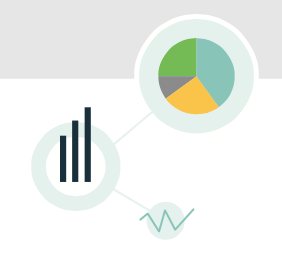
Pie Charts
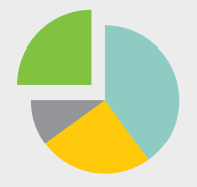
Pie charts resemble a sliced pie, with each “slice” representing a different value, and each colored and/or sized differently. Use it to portray and compare multiple data sets and illustrate relative magnitudes, frequencies, or percentages.
Whisker Charts or Box Plots

Whisker charts, also known as box plots or whisker plots, are named for the vertical lines extending from the boxes. Use them to show the distribution of a data set in statistical analysis. The vertical lines express variability outside the upper and lower quartiles.
Polar Charts

Polar charts have many names, such as radar charts, web charts, spider charts, and star charts. Use this 2D chart to display multivariate observations with an arbitrary number of variables.
Gauges

Gauges display data in a single dimension and show you whether something is on target, above target, or below target. They are best used in situations where you have a fixed range and want to show where a value lies within that range.
Bubble Charts

Bubble charts compare entities in terms of their relative values, positions, and size. Like scatter charts, bubble charts can be either 2D or 3D.
Area Charts and Line Charts
Area charts are data visualizations best used for showing accumulated totals over time. Similar to line charts, area charts can often provide a deeper viewpoint of multiple data sets. Here’s an example of a line chart and an area chart for comparison:
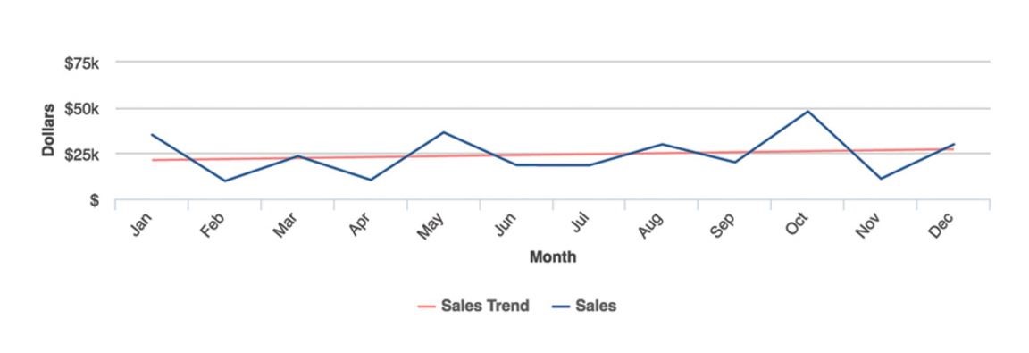
The line chart above is useful for visualizing continuous data over time (it also shows a red trend line or goal line). On the other hand, the area chart below shows cumulated totals over time.
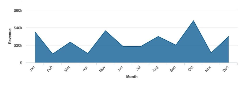
Use line charts to show totals, not area charts.
Bar Charts and Stacked charts
Bar charts are best used to compare categories against each other. A standard bar chart displays the values proportional to the size of the bars which are plotted either vertically or horizontally with one axis for the value and another for the category.
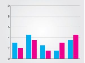
Stacked bar charts combine two category bars from a standard chart and stack them on top of each other. Though visually pleasing, stacked bar charts can confuse the viewer, causing them to misinterpret the data—users may not know whether the pink area in the below chart starts from the same baseline as the blue (at 0) or if it starts at the top of the blue area, for example.
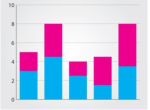
Use stacked bar charts to represent totals; otherwise, use bar charts.
Pyramid Chart

Pyramid charts are ideal for visually comparing data with different values represented in different pyramid layers. The above example is a 2D chart but pyramid charts can also be 3D.
3D Charts
While flat charts have their place, there are instances when you can benefit from having an extra perspective. 3D charts allow you to consider your data in more terms, such comparing overlapping trend lines to compare data sets against each other.
Keep in mind that adding a third dimension to a 2D chart may look visually appealing, but it doesn’t guarantee or enhance comprehension by the viewer. If the information you’re presenting can be most easily analyzed as a 2D visualization, use one of the examples covered earlier. However, some data benefits greatly from being presented in the 3D charts below.
Heat Map

A heat map presents the viewer with a geographical representation of data— individual values are shown as colors, with the size or distribution of the value (such as demographics in a certain area) indicated by the size of the heat map cells. This tool is useful for showing two-column values of multiple rows of data.
GIS or Geographic maps
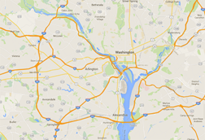
GIS maps spatially visualize geographic data for analysis. Data can be shown on any scale—streets, cities, countries, etc. Similar to heat maps, the data can be color coded to show performance or activity in a certain area, such as sales.
Use GIS maps to determine the location of customers or customers with specific buying or browsing habits. They can also be used to plot areas where new store locations or other facilities could be located.
Good GIS mapping tools already have access to built-in geographic data from publicly available sources (e.g. census records). Drill down and drill through methods (discussed below) are often used in GIS map visualizations for added detail.
Scatter Chart
 Scatter charts show the relationship between a large amount of data points and is displayed as dots or points. Each point has two values, indicated by the position on the horizontal and vertical axes. A company’s expenses and revenue could be plotted to investigate the relationship between the two. Scatter charts can also be 2D.
Animated Visualization
Another way that data can be visually represented is through animation, which can allow for more complex analysis of data. Animated visualizations typically use Flash or HTML5 to display images.
Drill down
Drill down visualization allows the user to navigate from a general view to a more specific one by clicking on the screen. The user can solicit increasingly granular information from the tool by doing so.
Drill Through

Drill through visualization allows the user to pass from one report to another while still analzying the same set of data, often by zooming in or or clicking for more detail. Unlike drill down visualization, the same information is presented through different means of analysis (cycling charts on the same data).
View more examples of visualizations in the insightsoftware Visual Gallery.