A Quick Guide to Embedded Dashboards
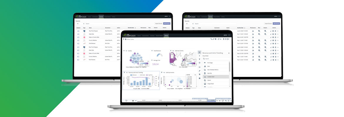
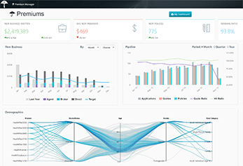
Understanding embedded analytics dashboards starts with knowing what the term itself means—so let’s break it down. Dashboards are screens or pages that display information in a unified view that makes data easily digestible for end users. Embedded dashboards are screens that display data and analytics within existing business applications. Think of the analytics dashboards and reports you might see in your usual business applications (Salesforce, Google Analytics, etc.) or consumer applications (Fitbit, your personal banking app, etc.).
Embedded dashboards may display data such as:
- Business reports related to financials, productivity, or other key metrics
- Workflow visualizations
- Personal notifications
Embedded dashboards provide value to end users by distilling large datasets into actionable information and presenting the information in the context of tools they already use every day.
Popular Data Visualizations in Embedded Dashboards
Data can be represented visually in a variety of ways in an embedded dashboard. Below are some of the most common data visualizations used in embedded dashboards:
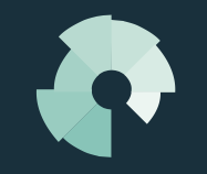
 Pie Chart: Illustrates a parts-to-whole comparison between disparate datasets, with each wedge of the pie representing a percentage or magnitude.
 Scatter Chart: Shows how two continuous variables relate to one another—answering the question “Are these two metrics related in some interesting way?”—and can be used to indicate correlation patterns in data.
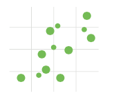
 Bubble Chart: Similar to scatter charts, a bubble chart is a way to show multivariate data. Bubble charts show three variables, breaking entities down by their relative values, positions, and size.
![]() Whisker Chart: Illustrates the distribution of a dataset vertically using boxes known as whiskers.
Whisker Chart: Illustrates the distribution of a dataset vertically using boxes known as whiskers.
 Polar Chart: Displays cyclic data—for example, number of sales each month—in the form of a two-dimensional chart.
![]() Gauge: Illustrates where a point-value KPI falls against a target range.
Gauge: Illustrates where a point-value KPI falls against a target range.
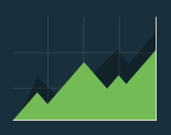 Area Chart: Displays cumulated totals using numbers or percentages over time.
 Funnel Chart: Plots one continuous variable against a categorical value, illustrating stages in a process and displaying potential gaps in that process. Because the stages should always be in the same order, a funnel chart may not always, in fact, look like a funnel.
The Definitive Guide to Dashboard Design
Download NowHow to Design Embedded Dashboards
Whether you’re designing dashboards from scratch or leveraging a third-party analytics platform to create them, you should keep a few critical best practices in mind as well as board reports best practices. These tips for designing embedded dashboards fall into a few categories:
Content
- Only display the content most relevant to the end user who will be viewing a particular dashboard. You can use show modes and conditions to hide content that doesn’t need to be seen by different users.
- Avoid obscuring important content by overdesigning with distracting visual effects such as background gradients or shadows.
- Use iconography instead of captions or other text. This saves space and improves the user experience by denoting common actions like close or delete.
Layout
- Group related data close together to help focus the user’s attention on critical information.
- Avoid distractions by keeping design elements roughly the same size.
- Limit the amount of data included on a given screen to avoid overcrowding.
Color
- Use dashboard color schemes with a few different colors that are each different enough from the others to avoid confusion.
- Use bright colors (e.g. yellow or red) when you want a particular design element or piece of content to “pop” and draw the user’s immediate attention.
- Keep meaning in mind. A user’s brain may associate red with “stop” and green with “go,” so ensure that the dashboard colors you choose align with the desired connotations.
Font
- Stick to a single font type to avoid confusing the user.
- Limit a dashboard to three font sizes max to create a clear yet simple visual hierarchy.
- Use bold fonts sparingly and only to highlight category headers or important content.
17 Dashboard Design Tips for Non-Designers
Download NowUsing Embedded Dashboards to Visualize Data
Companies can use analytics dashboards and reports to visualize important data to help in the decision-making process. Whether they decide to build or buy the software to customize their OEM embedded dashboards depends on their customer’s needs and what makes the most sense for the business. Check out a free demo of our embedded analytics platform to see how you can build custom executive dashboards quickly and easily to visualize data.