Visualizing for the Color Blind
Color blindness is a color vision deficiency which affects roughly 8% of the North American male population and 0.5% of the female population. So when designing data visualizations and dashboards, it’s important to keep this group of people in mind to make sure they are seeing the same results as everyone else.
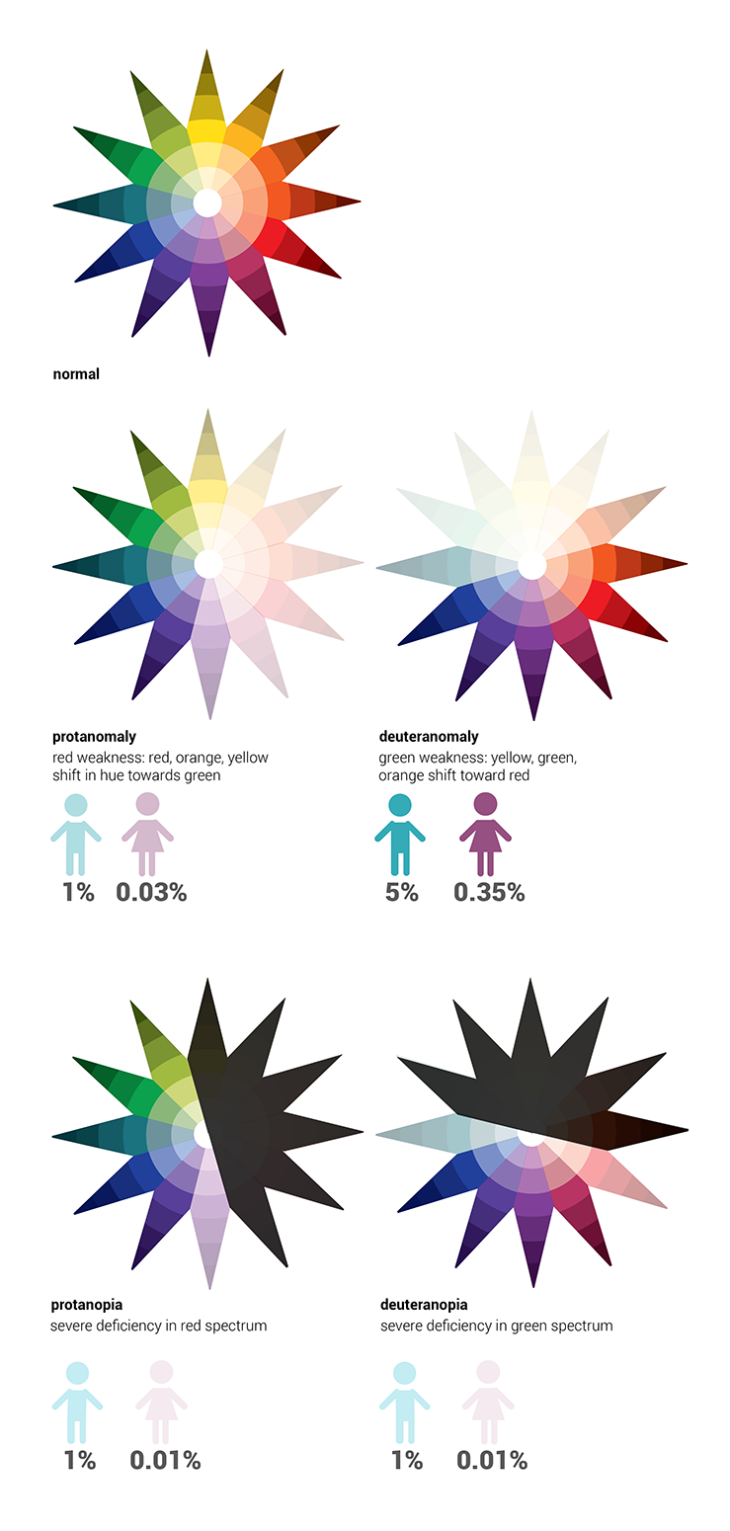
You have three different types of cones in your retina: red, green and blue. Most people affected with color blindness are missing one or more of these cones or have them malfunctioning, which means that they may not be able to distinguish between certain pairs of colors in the same way someone with all three functioning cones can. Color blindness comes in three types:
- Protanopia/protanomaly (missing or malfunctioning red photoreceptors)
- The inability to perceive red or a reduced sensitivity to it, making purple seem blue
- Deuteranopia/deuteranomaly (missing or malfunctioning green photoreceptors)
- The inability to perceive green or a reduced sensitivity to it, making green seem brown
- Tritanopia/tritanomaly (missing or malfunctioning blue photoreceptors)
- The inability to perceive blue or a reduced sensitivity to it, making yellow seem red
Red and green color blindness (deuteranomaly & protanomaly) are by far the most common and are usually grouped together because people with these deficiencies see color in a very similar way. Blue-yellow color blindness (tritanomaly) is extremely rare, affecting less than 0.01% of all color blind people.
When designing dashboards, one of the most important factors for communicating information is color. Color has four characteristics:
- Hue: the color itself
- Lightness: how light or dark the color is
- Saturation: the amount of hue applied to an area, ranging from pale to saturation
- Intensity: how both lightness and saturation are manipulated
In relation to how a color blind user may see the characteristics of color, it’s important to keep in mind what you can do to make your visualizations more accessible to the color blind.
• Hue: Color blindness is essentially an inability to distinguish between different hues of equal intensity. A red-green color blind person may have issues distinguishing red, green, brown, orange and yellow, and will generally confuse blue and purple hues. Blue-yellow color blind people have trouble distinguishing between violet and red, seeing both in a duller hue; blue and green, which will appear as red or blue; and blue and yellow.
• Intensity: since a color blind person can easily distinguish between different intensities, color blind people struggle most when there is no intensity variation in what they are looking at.
• Proximity: the color blind are affected the most when similar colors are grouped closely together. A red-green color blind person would unable to distinguish reds and greens on a chart if they were placed close to each other.
• Size: When the size of color-coded objects is small, only a few cone cells can be used for recognition. Colorblind people find it especially difficult to distinguish the colors of thin lines and small symbols. The larger the solid-colored object is, the easier it is for a color blind person to determine its color. The smaller you make an object, the more difficult it is to tell its specific hue.
Design Recommendations
- Play It Safe: Avoid situations where several color blindness factors come into play. For example, when designing a scatter plot with different color dots, make sure the dots are either large, spaced out, or have a wide range of intensities (light green, dark red). The use of symbols to supplement your color-schemes can also be useful for the color blind.

- Know What Works: Avoid choropleth maps (which show areas shaded in proportion to the measurement being made) with similar-intensity colors. When this is unavoidable (e.g. when dealing with many different colors of similar intensity), use patterned backgrounds or labels to help color blind users distinguish between colors.

- Interactive Highlighting: When using color to indicate a category (e.g. coloring series on a chart), allow users to hover the mouse over the series legend to highlight that series (by increasing the intensity of that series and decreasing the intensity of the others).

- Know the Combos: Avoid using gradient colors to indicate data values, in particular green-red gradients, green-yellow, blue-purple, blue-red, green-light blue, green-brown, pink-white, red-orange, red-brown, or brown-black.
By understanding how color blindness works, as well as following a few simple design guidelines, you should be able to create effective data visualizations that appeal to everyone. More than 8% of your users will thank you!