Visualizing Text Analysis Results with Word Clouds
A Word Cloud or Tag Cloud is a visual representation of text data in the form of tags, which are typically single words whose importance is visualized by way of their size and color. As unstructured data in the form of text continues to see unprecedented growth, especially within the field of social media, there is an ever-increasing need to analyze the massive amounts of text generated from these systems. A Word Cloud is an excellent option to help visually interpret text and is useful in quickly gaining insight into the most prominent items in a given text, by visualizing the word frequency in the text as a weighted list.
As of v5.0.1, Dundas BI allows you to visualize data using the native Word Cloud visualization that displays text with color and size.
This blog will demonstrate how to create a Word Cloud in Dundas BI using the D3.js library. Note that this is not required if the native Word Cloud visualization is used in v5.0.1 onwards as it can now be created in a few clicks.
In this example, we’ll use retail data stored in a SQL database and will analyze what customers have to say about a particular retail store. You can apply the same process to analyze data from any other source such as Twitter, Facebook, etc.
Word Frequency Analysis
The first step in visualizing data as a Word Cloud is to analyze the text and retrieve the frequency of each word within the text. In our example, customer reviews are stored in a SQL table column, and a text mining algorithm is run on that column to obtain the word frequency.
Data Cube
To do this, first, create a data cube and drop the table that stores the text column. In our case, the text is stored in a SQL table called [dbo].[Comments]. The data cube and the result look like this:
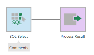
Figure 2: Create the Data Cube
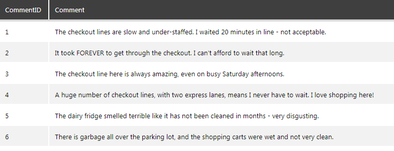
Figure 3: Data preview
Next, drop the R Language Analysis transform that will allow you to implement the text mining using the R language. If you’ve never used the R Language Analysis transform, you may want to start here.
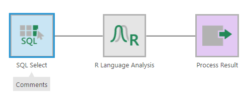
Figure 4: Add the R Transform
Configure the R Language Analysis transform and add a placeholder for the text column. In this case, the text column is called “Comment,” and a placeholder “text” is defined for it. This placeholder will be used in the text mining algorithm below.
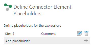
Figure 5: Add the placeholder for the text column
Once the placeholder is ready, add the R script below in the “Edit Script” section. The script uses the text mining library called tm (click here for more details on the tm package) to calculate the frequency of words present in the text and outputs the word and its frequency. In other words, this determines the number of times the word appears in the text:
library(tm);
review_text <- paste($text$, collapse=” “);
review_source <- VectorSource(review_text);
corpus <- Corpus(review_source);
corpus <- tm_map(corpus, removePunctuation);
corpus <- tm_map(corpus, stripWhitespace);
corpus <- tm_map(corpus, removeWords, stopwords(“english”));
dtm <- DocumentTermMatrix(corpus);
dtm2 <- as.matrix(dtm);
frequency <- colSums(dtm2);
frequency <- sort(frequency, decreasing=TRUE);
frequency <- head(frequency, 50);
output <- data.frame(names(frequency), frequency);
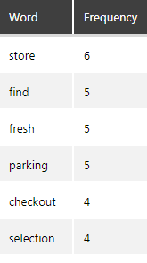
Figure 6: Word frequency result
Note that this algorithm will not only count the number of times a word appears in the text (in this case all the customer comments). It will also perform necessary data preparation, such as removing any punctuation, spaces and stop words (commonly used words such as “the” that we don’t want to count).
As a result, it will return the top 50 words with the most appearances in the text.
Creating the Word Cloud
Create a Table
On the dashboard canvas, create a table visualization from the above data cube that will be used to populate the word cloud.
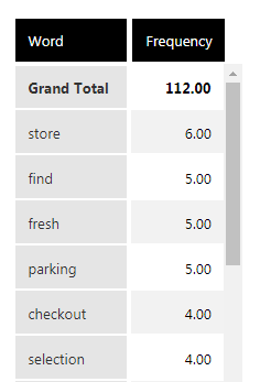
Figure 7: Create table on the dashboard
The script name of the table (found in its properties) will be used in the Word Cloud script in the next section. Rename this script name if required
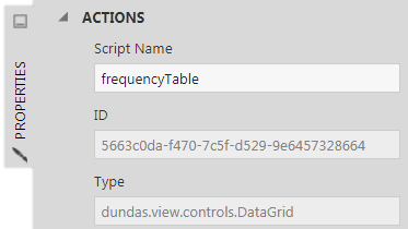
Figure 8: Note the table’s script name
Create the Word Cloud
To create the Word Cloud, we’ll use the D3.js library and will be referencing the sample from here:
https://github.com/jasondavies/d3-cloud
In the Ready event of the dashboard, add the D3.js script to create the Word Cloud.
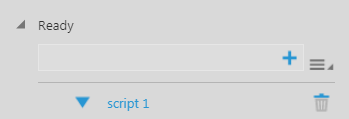
Figure 9: Add the script in the Ready event of the dashboard
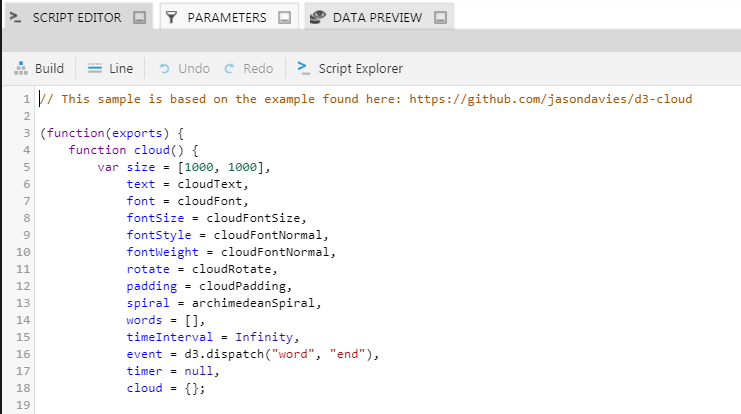
Figure 10: Script to create the word cloud
Display Data on the Word Cloud
To display data on the Word Cloud, we’ll use an HTML label component that will act as the container for the cloud and will allow us to position and re-size the cloud as needed on the dashboard canvas.
To add the label to the dashboard canvas, expand the Components section in the toolbar and drop the HTML label on to the canvas.
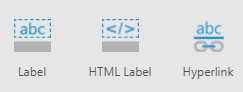
Figure 11: Add the HTML Label
Go to the Text properties and set the HTML label text property to <div></div>
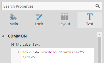
Figure 12: Set the HTML Label Text
Now add another script in the Ready action of the dashboard that reads the data from the table created earlier, binds it to the Word Cloud and displays it in the HTML label container. To ensure the Word Cloud changes when the data changes on the table, such as when changing filters, etc., add this script in the Data Changed action of the table as well.
In this script, the table is referenced as frequencyTable, and the HTML label is referenced as wordcloudContainer. Make sure the script names of the table and the HTML label controls on your dashboard match the names in the script:
// get the html label that will display the word cloud
var placeholderElement = document.getElementById(‘wordcloudContainer’);
//get the data result from the frequencyTable
var data = frequencyTable.metricSetBindings[0].dataResult;
// disable paging to make sure the datapoints displayed are not limited due to it
data.request.pagingOptions.pagingKind = ‘None’;
//store the words and their frequencies as an array
var frequency_list = [];
for (i = 0;i<data.cellset.cells[0].length;i++)
{
var text = data.cellset.rows[i].members[0].caption;
var value = data.cellset.cells[0][i].value;
value = value * 10;
frequency_list.push({“text” : text, “size” : value});
}
//define the color scheme to be used
var color = d3.scale.linear()
.domain([0,1,2,3,4,5,6,10,15,20,100])
//.range([“#ddd”, “#ccc”, “#bbb”, “#aaa”, “#999”, “#888”, “#777”, “#666”, “#555”, “#444”, “#333”, “#222”]);
.range([“#000000”, “#000000”, “#000000”, “#000000”, “#000000”, “#000000”, “#000000”, “#000000”, “#000000”, “#000000”, “#333”, “#222”]);
d3.layout.cloud().size([500,500])
.words(frequency_list)
.rotate(0)
.fontSize(function(d) { return d.size; })
.on(“end”, draw)
.start();
//draw the words on the html label
function draw(words) {
d3.select(placeholderElement).append(“svg”)
.attr(“width”, 500)
.attr(“height”, 500)
.attr(“class”, “wordcloud”)
.append(“g”)
// without the transform, words would get cutoff to the left and top, they would appear outside of the SVG area
.attr(“transform”, “translate(320,200)”)
.attr(“transform”, “translate(140,125)”)
.selectAll(“text”)
.data(words)
.enter().append(“text”)
.style(“font-size”, function(d) { return d.size + “px”; })
.style(“fill”, function(d, i) { return color(i); })
.attr(“transform”, function(d) {
return “translate(” + [d.x, d.y] + “)rotate(” + d.rotate + “)”;
})
.text(function(d) { return d.text; });
}
Result
Now view the dashboard to see the result. It should display the words from the table and show them in different sizes based on their respective frequencies:
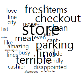
Figure 13: Result
Summary
As you can see, a Word Cloud provides the ability to analyze any text quickly and depicts valuable information on critical discussed topics. The above example shows how to create a rudimentary Word Cloud in Dundas BI. You can modify and strengthen the Word Cloud’s appearance by adjusting its script, and by adding additional enhancements such as different color schemes, which can be shown based on the frequency of select words.
The Word Cloud is an excellent visualization by which to highlight key words in a text quickly, however, it is not as adept a visualization for performing accurate analysis, which is often the goal when performing text analysis in a business context.
To close this gap and provide both the first quick insight gained by a quick glance at the Word Cloud, as well as the accurate view needed for business analysis, we recommend overlaying the Word Cloud on top of a Bar Chart showing the same result. Here’s an example of what that looks like on a dashboard:
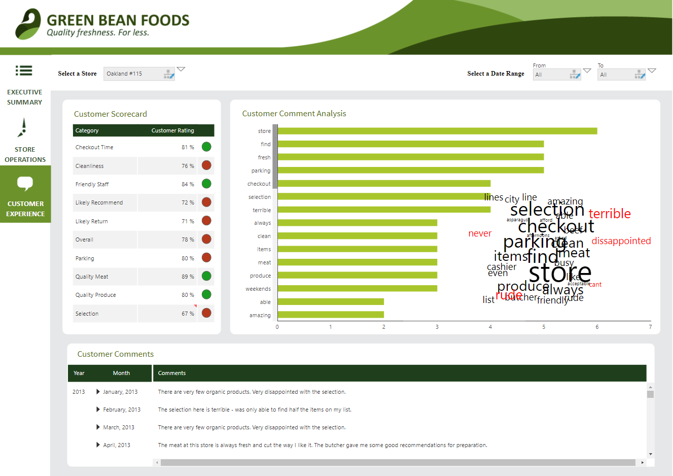
Figure 14: Word Cloud overlaid on a Bar Chart
Another great way of visualizing data and creating a dashboard is using Pareto charts in Power BI.