Beyond Responsive: Top Trends in Mobile BI

Mobile is changing the way we work. Whether we’re paying bills, reading the news, or purchasing goods, we’re doing it all on mobile devices. And it’s changing the way businesses need to deliver information.
But what does that mean for BI? Dashboards and reports must be designed to deliver information in an easier, more consumable way. And, because we’re dealing with non-traditional interfaces – and consequently, less real estate – as well as workers on the move, it’s more important than ever for this information to be meaningful.
Designing for mobile used to be limited to responsiveness alone. Today, design goes way beyond that.
Let’s take a look at a few design trends and how they can be applied to mobile BI.
Design Concepts For A Superior User Experience
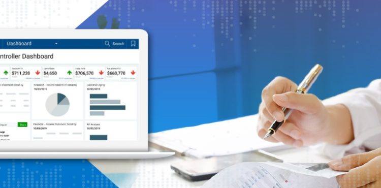
Download NowKnow Your Users
Whether your users are at the airport, a client site, or at home on a Sunday morning, mobile devices are essential to getting the answers they need quickly and efficiently. It’s critical to know who your target user groups are so you can understand when they’re likely to access mobile dashboards and reports and for what purpose.
Here are a few sample use cases for mobile BI:
- Nurses need to view patient care statistics and information in real-time so they can care for each patient individually when an issue arises.
- Executives, who are constantly traveling from headquarters to branch offices or customer sites, need to stay updated on the latest KPls and performance metrics.
- Operations managers in the oil and gas industry need to know each day’s production volume so they can forecast numbers for the next month.
Follow the Eyes
In today’s day and age, people have lots of options on what to consume and how to consume it. Whether they use a Kindle, a newspaper, or a hardcover book, these media all have one thing in common, at least in North America: they are meant to be read from left to right and top to bottom.
When it comes to dashboard design, you should absolutely follow the same rule. Place the most important details from top left to bottom right. This is where the user’s eyes will naturally start, so get them off on the right track.
Design for the fat finger
We’ve all been on our mobile device and tried to touch one thing but ended up selecting something completely different. This can be frustrating and time consuming.
That’s why, once a user reaches your dashboard, you want to remove barriers to information consumption, including any click paths to dive deeper and explore other visualizations.
Make sure to incorporate spacing between filters, links, and visuals. The small screens on most mobile devices make it challenging for users to select objects that are right next to each other. Touch targets should be at least 48 x 48 dp (display picture) and they shouldn’t overlap. This ensures that users will be able to reliably and comfortably target them with their fingers.
These are just a few trends to consider when designing for mobile.
The Definitive Guide to Dashboard Design
Download Now: