Working with Pivoted Data in Power BI

Oftentimes we have data in a format that is not suitable for creating visualizations in Power BI, for example, pivoted data. However, we still want to work with that data. Let us explore this in more detail.
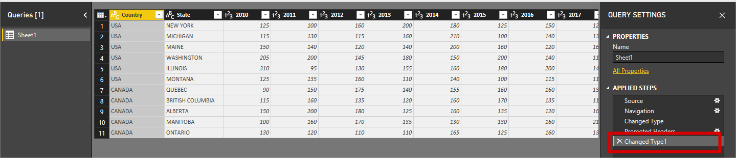
Suppose we have a table of data representing units sold of some product across USA and Canada in the following format:
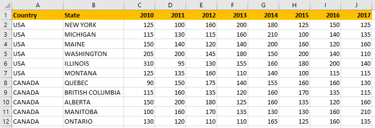
The first column represents the Country. The second one represents the State of that country. The other columns are Years. The values in the Years columns represent the Units sold. Our task now is to create some visualizations in Power BI, where we can see Totals: units sold by year, country and state, etc.
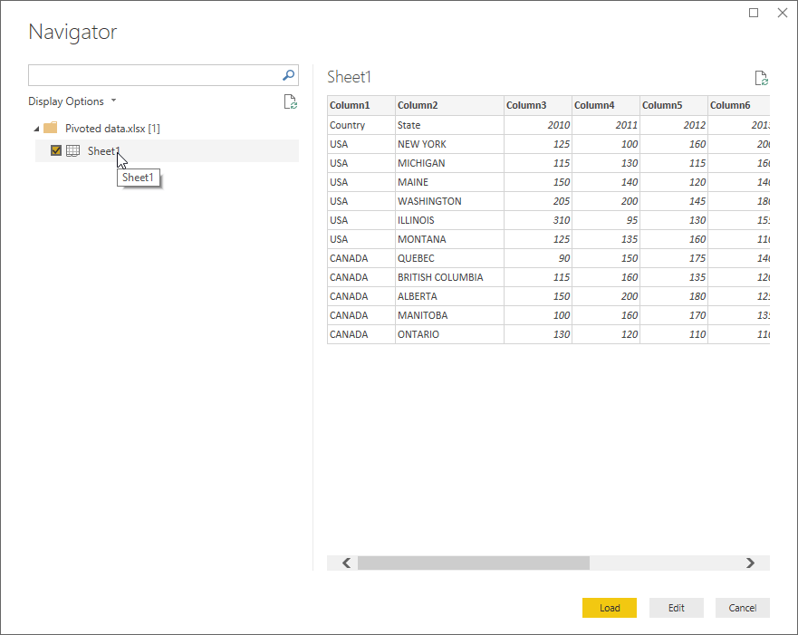
The first thing we do is load this data into Power BI:
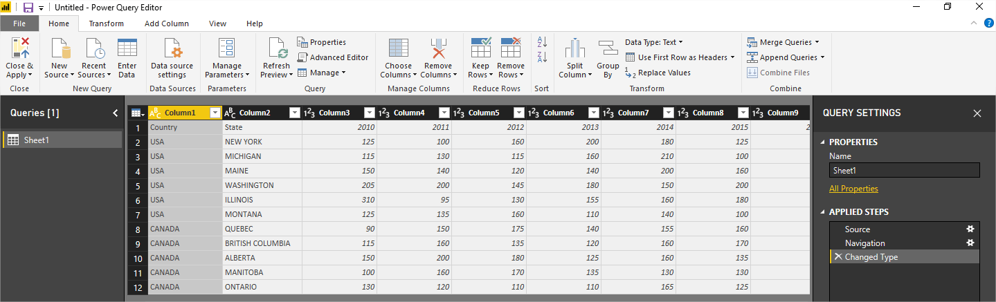
We noticed that the headers are not recognized as such, so we need to go to the Power Query Editor. We click edit and get the following view:
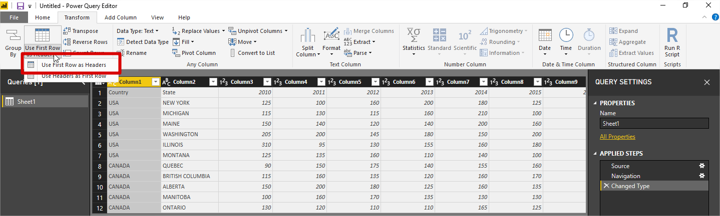
Now we go to the Transform tab and Promote the first row as a header:
Now we see that the headers are OK:
Additionally, Power BI automatically added a new step in query editor, detecting the columns datatypes.
Let’s load this form of data into the model and start exploring:
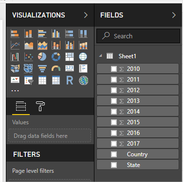
We can see that all the columns are there, just as in the Excel document. To add some visualizations, let’s put Total of units sold per year in Card visuals:
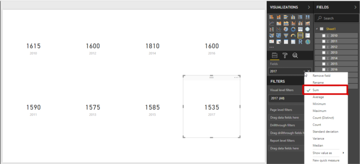
We see that Card visuals represent the Sum of the values of each year. This is OK, but some questions arise here:
- What if we want to see the Grand total in Card visual?
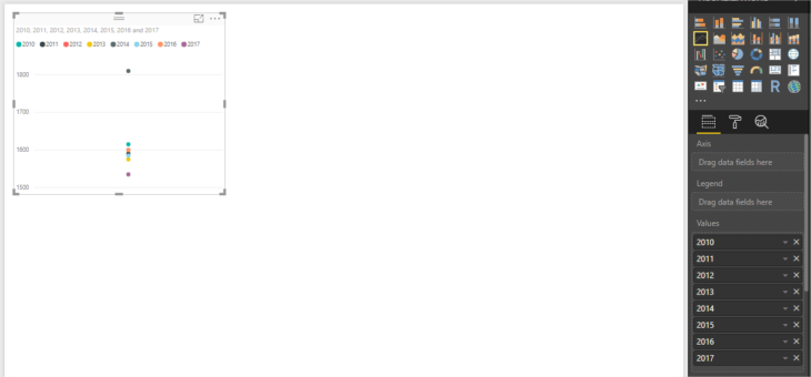
- What if we want to see trends in Line chart visual showing Units sold by Year?
The answers to these questions are as follows:
- We need to use DAX to create a measure that sums the values of units sold per each year. So, we need to know DAX. In this case, it may not be too complicated, but if we want more columns then it would increase in complexity. Here is the DAX formula to calculate sum:
Grand total = sum(Sheet1[2010]) + sum(Sheet1[2011]) + sum(Sheet1[2012]) + sum(Sheet1[2013]) + sum(Sheet1[2014]) + sum(Sheet1[2015]) + sum(Sheet1[2016]) + sum(Sheet1[2017])
- With the current structure, we cannot do that. See the figure below, it doesn’t even look like a Line chart:
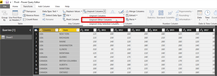
To address these problems, we need to unpivot data so to have years in Rows instead of Columns. Let’s go back to the Power Query Editor. We need to transform data in 4 columns: Country, State, Year and Units Sold. To do this, we select first two columns and choose Transform >> Unpivot Columns >> Unpivot Other Columns
We get the following view:
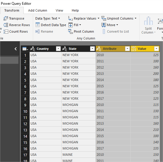
Now we rename the two unpivoted columns and we have:
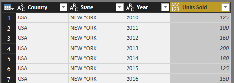
So, this is the correct format needed for creating visualizations in Power BI. Let’s load this to the model:
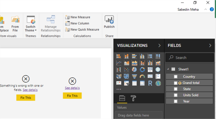
We notice that the existing visuals are broken, as well as the measure we created. This is because the model no longer contains the columns that were used to create the visuals and the measure.
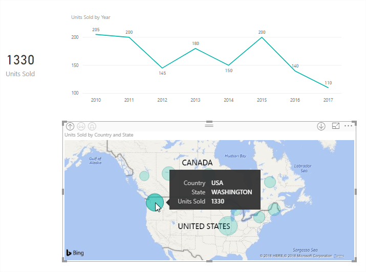
We now remove the broken visuals and the measure, and we are ready to create other visualizations. For example, we can create Card visuals representing Total Units Sold, Line chart representing Units sold by Year, Map visual representing Units sold by country and state, etc.

Thankfully, the visuals now interact with each other, which was certainly not the case with the original model we got from the data source.
View more Power BI Tutorials at www.powerbitutorial.org
What is your experience working with PivotTables in Power BI? Have you run into this challenge and overcome it? We’d love to know.
As passionate enthusiasts of Power BI, we want to enrich your data visualization experience. Learn more about how Jet Reports works alongside Power BI to deliver accurate, fast and controlled information the enables you to make strategic and effective data-driven decisions.
Related Resources

The Path to Data Leadership: Embracing Embedded Analytics