How to Use Heat Map Charts to Recognize Patterns in Complex Data
Analyzing and making sense of large volumes of raw data can make anyone’s head spin. This is why it’s important to take a step back and get a generalized view of the data before diving into more granular analysis. A great tool for distilling insights from massive datasets – and one that’s particularly handy for visual comprehension – is the Heat Map.
For those of you familiar with business intelligence (BI) and data visualization, if I were to mention the term ‘Heat Map’, each one of you may envision something entirely different. Despite your daily exposure to a dizzying array of charts and graphs, and your knowledge of BI terminology, it’s still highly plausible multiple Heat Map variants would come to mind.
And that’s completely OK! What many people don’t realize, is that Heat Maps are not data visualizations in their own right, per se, but are visualization properties that can actually be applied to a wide variety of data visualizations to better illuminate trends, outliers and patterns in your data. They also happen to be highly effective at doing their job. One of the more ignored facets of data visualization, and data-discovery for that matter, is in fact pattern recognition, and Heat Maps bridge that gap marvelously.
What is a Heat Map Chart?
Let’s get down to business. If you’re still reading this, it’s because you have a great deal of complex data and are intrigued by how a Heat Map Chart can be leveraged to reveal patterns within it. That, or you’re looking to add some heat to your map visualizations.
So, what exactly is a Heat Map Chart? Well, it’s essentially a tabular matrix that leverages color variety and intensity to visualize and examine complex, multi-variate data. By displaying your variables both horizontally and vertically and coloring the newly created cells according to some pre-defined logic, you’re able to better see variance, patterns, and correlations across the data set (if any exist).
Now, rather than relying on my descriptive capabilities (or lack thereof), let’s take a look at an example of a Heat Map Chart that’s been built using Dundas BI to understand what one could look like:
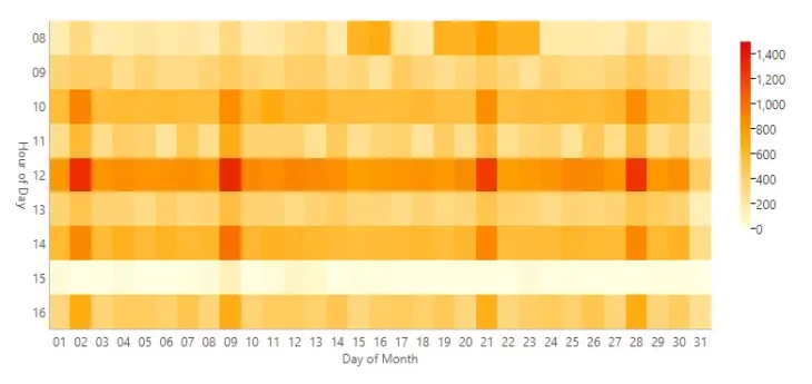
Wow – beautiful isn’t it! In a typical Heat Map Chart – as is the case in this example – each axis will be used to display one category (for example, Day of Month along the bottom, and Hour of Day along the side). The individual rows and columns will then be further divided into color-coded subcategories (or cells) based on the value they contain, which is based on their relationship between the aforementioned intersecting rows and columns.
Basics of a Heat Map Chart
A heat map chart is a graphical representation of data where values are depicted by color. It provides a visual summary of information by using a range of colors to represent different data values, allowing viewers to quickly grasp patterns, trends, and outliers within the data set. Heat maps are particularly effective for displaying the variation across a two-dimensional plane, making them ideal for comparing categories, understanding how data points relate to each other, and identifying which areas receive more attention or activity.
Features of a Heat Map Chart
- Color Coding: Heat maps use a color spectrum to represent data values, with different colors indicating different levels of a metric. This can range from cool to warm colors, signifying lower to higher values, respectively.
- Interactivity: Many heat map charts are interactive, allowing users to hover over or click on specific areas to get more detailed information about the data represented.
- Customization: Users can customize the color range, scale, and sometimes the granularity of data displayed on the heat map to better suit their analysis needs.
- Integration: Heat maps can often be integrated into dashboards and reports, combined with other data visualization tools to provide a comprehensive view of the data.
How is a Heat Map Chart Read?
When analyzing numerical data using this type of Chart, the differences between low and high values are noticeable due to the varying intensities of color. The more intense the color in a cell, the higher the value. This, in essence, is how a Heat Map Chart should be read.
What you may notice, is that the Color Scale (a legend I cannot recommend enough for this chart type) accompanying the Heat Map Chart uses a gradient scale from 0 to 1400 (we’ve gone ahead and broken it down visually in increments of 200 for the viewer to better grasp the change in values).
Remember earlier when I mentioned Heat Map Charts are great at generalizing large volumes of data? No? Paragraph 1, line 3! Well, now you can start to understand why. Seeing as they rely heavily on color to communicate values, it can be hard to accurately identify the differences between shades of color and isolate individual data points. This isn’t to say that the Heat Map Chart can’t be used for more granular analysis, it’s just better suited for high-level generalizations and can be used as a springboard for further inquiries.
Types of Heat Map Charts
- Geographical Heat Maps: Used to display data across different geographical locations, showing density or intensity in various areas on a map.
- Matrix Heat Maps: Ideal for comparing data across two categories using rows and columns, like in a spreadsheet. These are often used in correlation analysis or to show cross-tabulated data.
- Webpage Heat Maps: These track and display user behavior on a webpage, such as where users click, how far they scroll, and what they look at, using colors to represent areas of high and low activity.
Legends in Heat Map Charts
Legends in heat map charts are critical for interpreting the data accurately. They explain the color scheme used in the chart, indicating what each color represents in terms of data values. Legends typically show a gradient or range of colors, with labels denoting the data value or range associated with each color. This allows viewers to understand the scale of measurement and to interpret the heat map correctly.
When You Should Use a Heatmap
Heat maps are particularly useful in situations where you need to:
- Analyze Patterns and Trends: When you want to quickly identify patterns, trends, and anomalies in large data sets.
- Compare Data Sets: To visually compare various categories or groups of data across different variables.
- Understand Distribution and Density: Ideal for geographical data analysis or when you need to show how certain values are distributed or concentrated in specific areas.
- Visualize Correlations: To showcase the relationship between two variables and identify areas of strong or weak correlation.
- Analyze User Behavior: For websites and applications, to understand user interaction patterns, optimize user experience, and improve website design.
Heat maps are a powerful tool for data visualization, offering an immediate visual summary of information. By effectively using color to represent data values, heat maps can reveal underlying patterns, correlations, and insights that might not be apparent from raw data, making them an essential tool in data analysis and decision-making processes.